Which Vehicle Has the Best Silhouette?
Perhaps the best silhouette isn’t a minivan from Oldsmobile in the 1990s, but it clearly gets the ball rolling for Hagerty’s According to You series. Admiring the beauty of the profile view has been a thing for portraits of human beings for thousands of years, so it’s no surprise we apply that aesthetic preference to objects around us, like the automobile. This angle has endless appeal, and I’ll assume I am not the only person in the Hagerty Community who stops in their tracks when the long lines of a well-designed automobile crosses my path.
Car designers spend an inordinate amount of time ironing out the side view to ensure the front and rear ends will look proper for the entire vehicle. So let’s make a big deal about it and see which vehicle has the best silhouette in the eyes of our readers. To start things off, here’s my choice.

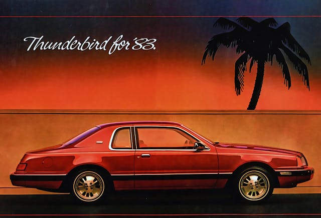
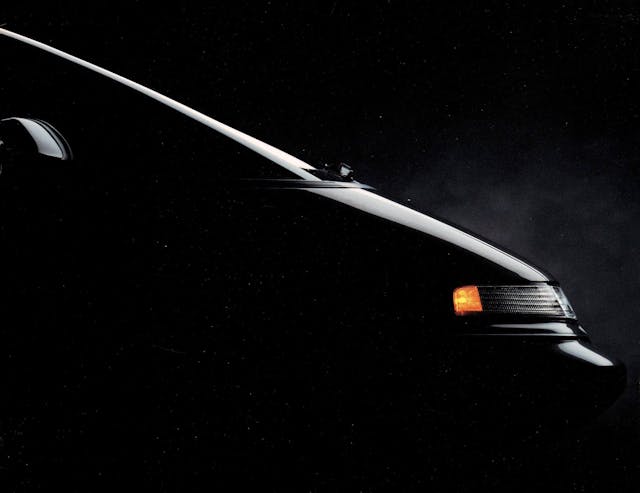
As a late Gen-Xer, I saw these Thunderbirds everywhere during my childhood. While their front end wore sealed-beam headlights that didn’t necessarily work with the aerodynamic body, that silhouette was to die for. It was a little bit cab backward, possessed a great mix of soft curves and hard muscles, and included window trim that harmonized beautifully with the overall shape.
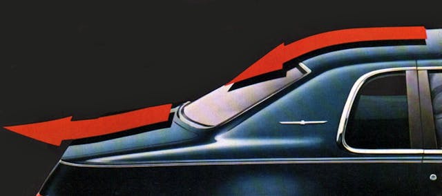
But I really started noticing these 1983–86 Thunderbirds after the 1987 redesign eliminated the aggressive drop in the trunk lid, the integrated ducktail, and the muscular contours in its thick C-pillar. The first three years of the “Aero Bird” looked like nothing before or since, and the car and its lovely profile passed far too quickly.

The way this C-pillar reflected the light at dawn or dusk was impossible to overlook, and though the overall shape wasn’t nearly as aerodynamic as the designs that replaced the 1983 Thunderbird, this truly was an automotive silhouette for the ages.
Which leads us back to our initial question: Which vehicle do you think has the best silhouette?
***
Check out the Hagerty Media homepage so you don’t miss a single story, or better yet, bookmark it. To get our best stories delivered right to your inbox, subscribe to our newsletters.


The T bird and Cougar really took off in the 80’s but the styling just never aged well. Today they look like cars with too much botox. I owned one and hated the thick pillars. Some complain about the Camaro today but our Cougar was blind spot heaven.
The best silhouette or profile of a car is the 62 Ferrari 250 Lusso. They got it all right in proportions. Its styling was years ahead of its time.
The first few years of the C3 corvette, I wasn’t around to see them new, but the c3 has always stood out in the school of cool IMO, especially the silhouette, I think the crash bumpers and other stuff of the later years softened them up too much, but the silhouettes of the early ones could’ve been used as scalpels
Ford GT40. Next question?
I almost agree with the GT40 Mk I, but also have great soft spots for the Lamborghini Miura and Jaguar XJ13. I know it’s cheating to not declare a single winner, but there you go. At least the silhouettes of these cars, particularly the GT40 and the Miura, are quite similar.
Like other aspects of car design you can sometimes see similar results from very different starting points. A few years back I took a picture of my ’72 Lotus Europa parked nose to tail with a ’73 El Camino. Very different cars in size and details but the overall silhouettes are remarkably similar.
For oversize vehicles, the 1973-1978 GMC Motorhome….ahead of its time when new, smooth and sleek (compared to other coaches) and has aged gracefully
Still a very sought after vehicle after all these decades. Would love to have one!
Hard to beat an early 911 in my book, but really, I’m voting for the Shelby Daytona Coupe. It has some of the muscle of the Cobras built in, with the sloped down nose for aero, the long sleek roofline and then that striking rear spoiler and chopped-off tail. It may not be the most beautiful, but to me, it’s the most striking silhouette out there.
63 Riviera
Not sure what got us there, but for decades after so many things owed it a debt. Would likely still be a cutting edge design if evolved to today’s construction methods/rules.
But it’s also amazing from several directions, not just the side.
Hands down, Jaguar E Type coupe (XKE)
I am partial to my 3C Corvette, but I must say the Jaguar XKE coupe Has been my favorite since I was very young.
I agree. I am partial to my 1973 Corvette Coupe. It’s a one year only design and looks great in silhouette.
Larry Shinoda’s favorite Corvette
As sleek as the XKE is, the windshield looks like it came off of a WWII Jeep. It just does not jell with the rest of the car.
And its ‘top-down’ sibling…the XKE droptop roadster… great road car…
Had a ’68 XKE roadster. I was about to cast my vote for it but, you astutely beat me to it!
Lamborghini Countach! It absolutely accentuates the 70s and 80s realm of excess!
I may be a bit of an outlier, but I have always favored the harder lines… think Conquest TSI
I do also like the aggressive lines of the C3 Corvette
… and the classic lines of early 70s trucks
… and… this is probably why I am up to 6
I’ll be the outlier here :
Toyota Previa turn the lights off and illuminated it from behind, and the egg shape still looks fresh today, even 30 years old.
I also think the Gen 1 or Gen 2 Taurus Wagon also has a great outline. I’m partial, as I have a stock photo of a white LX Wagon hanging in my Garage, but I think it still looks great today.
For the more modern, cheaper cars, I’d say the first generation of the Hyundai Genesis Coupe. The car itself was a mixed bag (I owned one for 8 years), but the side profile, especially in low light just highlighted how well that body was sculpted.
I’ll also say that the 3rd generation (FD) RX7 has timeless bodylines.
The log car that Barney Rubble drove on the flintstones…..feet and all
57 Ford Thunderbird!
Datsun 240z………baby jag
Agree! Derivative, but takes the best of the 250 GTO, XKE, and 911 and creates its own unique and beautiful design.
1964 Continental OR 1951 Hudson Hornet 4-door sedan.
Symmetry is everything.