Plastic Fantastic: The Joy of Buttons
Unless you’ve been living under a rock, you’ll have heard all about—or experienced—carmakers’ rush toward touch-screen technology.
There has been much wailing about it in the motoring press, and frustration via social media. However, to give manufacturers some credit, the modern car is so full of technology that condensing it all into easy-to-reach touch points is near impossible. In one modern car I borrowed this year, finding the button to alter the mirrors meant issuing a plea for guidance on social media.
Corralling all the functions onto one tablet makes sense—at least in principle—because you can pack more functionality into a small space. Well, in principle.
Just like those non-removable bottle caps that suddenly appeared this year, the concept behind them made sense, but the execution lagged behind—which is usually why I end up arriving for meetings wearing more of my in-car beverage than I’ve imbibed. Much in the same way, the touch screen technology in its current form doesn’t offer the instant response you might get from, say, twisting a knob or pressing some buttons.
Not only can you do this without having to take your eyes off the road to search through menus at 70 mph, but there’s a much more pleasant tactile feeling. Aston Martin has recently upgraded its interior to look and feel like high-end audio equipment.
However, there’s a joy to 1980s buttons that we love. This was an era of All The Technology, All At Once, which meant buttons and sliders for all sorts of functions sprouted up all over the dashboard and binnacles like a rampaging fungus. Add in hard black plastic and it all seems very Tonka Truck–style cool now—another way to feel at one with your car, other than driving, braking, steering, and swapping ratios.
We’ve pulled out some pretty amazing driving environments of the past—by no means comprehensive—but this list will certainly have you scouting out dashboard delight in the old cars around you.
Porsche 928

For many years, the 911’s interior was probably the least exciting part of the car. Indeed, it was often a criticism that for all the money you’d waxed on a 911 Turbo, the ambience wasn’t much more swish than a Carrera—or worse.
The 928 was different. Not only does it feel like you’re ensconced in a spaceship, all swoopy lines and multi-colored finishes, but the steering column moved. Other than the automatic shifter—which looked and felt like a Starship Enterprise thrust lever—our favorite part of the interior has to be the big twistable knobs to active lamps and windshield wipers. They’re comedically outsized for their function, but with a satisfying thunk to each movement. You could spend all day in there without turning the engine on, just interacting with it all.
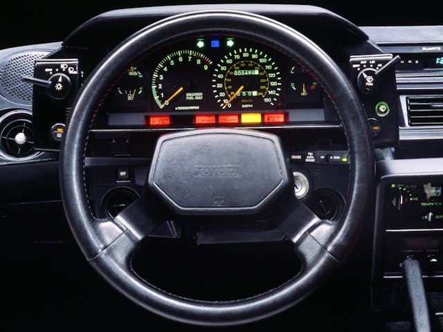
Toyota MR2 Mk1

Japanese manufacturers really got on board with binnacle-mounted functionality. The MR2’s dashboard is fairly simple—we love the green-tinged wording, for example. However, the enormous rotary switches, with little levers attached, that sprout from the binnacle surround rather than conventionally behind the steering wheel itself, just feel magnificent to use. Add in buttons for the de-mister and the washer jets and it all feels far more immediate for any MR2 maestro to use. With the comically large gearshift handle and handbrake (relative to the rest of the car), the MR2 is memorable even before you fire it up.
Nissan 300ZX (Z32)

Choosing just one car to demonstrate the Japanese appetite for binnacle-mounted button overload is hard—the Subaru XT offers up an intriguingly unconventional offset three-spoke steering wheel with more buttons on top, for example. However, we’ve gone for the Z32 300ZX because, as Nissan’s top-of-the-range two-door, it was festooned with all sorts of technology to tempt people out of their Porsches.
Of course, condensing all this into the dashboard was an almighty challenge—it even had a mini-LCD screen!—and you could spend a day trying to work out where everything was. What makes it even more special is that it still has stalks for the lamps and washers and all the functions on top. By rights this could all be annoying on the move but just look how cool it is, and how satisfying it must be when you finally stop setting off the foglight by mistake during quick cornering.
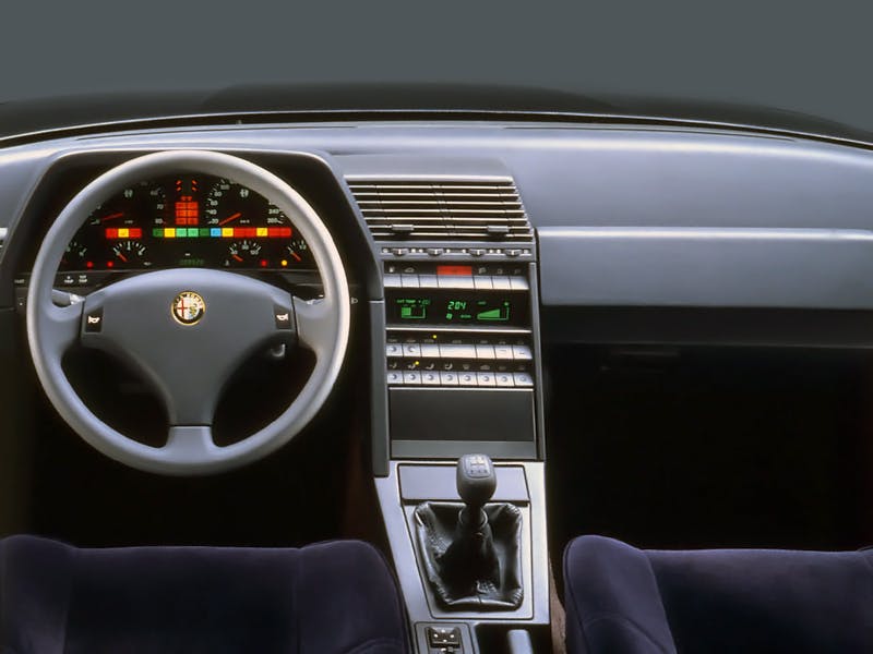
Alfa Romeo 164

For all of Alfa Romeo’s exterior flair, not all interiors to wear the hallowed badge are quite as stylish. The 164, however, was button overload, with a bonus LCD display. It was very much like driving around with a high-end stereo in the front of the car. One for the nostalgic person who spent many an evening staring at their dad’s graphic equalizer.
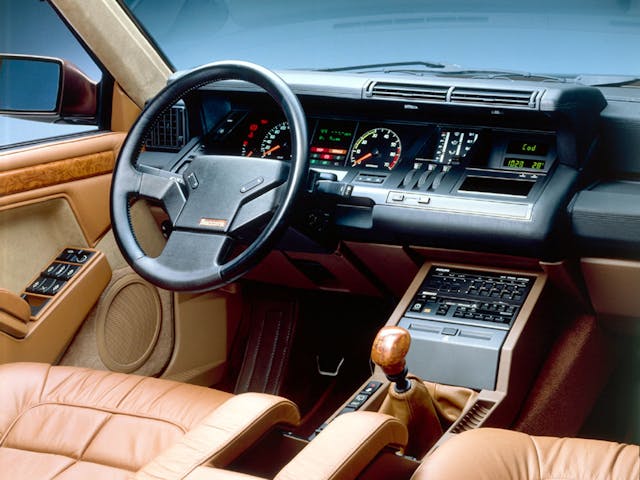
Renault 25

Marcello Gandini had a knack for bringing the majestic to the mundane—even his least exotic projects have the odd flash of magic to them. Now, the Renault 25 was anything but mundane from behind the wheel, even if the exterior wasn’t quite as exciting as other Renaults of the era. This luxurious cruiser was great for eating up autoroutes—but we would struggle not to get distracted by this magnificent interior from Gandini himself. It looks like it’s come straight from the Alien ship Nostromo, but with a center console from Giorgio Moroder’s living room. Even the door handles look like a haptic delight, and the steering wheel even gets in on the button action. A masterpiece.
Lancia Trevi

The Trevi is an unconventional-looking car, even from the outside. The true delight is when you get inside. CAR magazine memorably described it as having a “Swiss cheese Beta” dashboard. It was designed by Mario Bellini, who had made his name designing homewares and typewriters. He found himself with a very small space to get a lot of information, and his reasoning for the design was that it was purely structural.
He was pilloried at the time—it was roundly criticized for being ugly. Now though? It hangs like a magnificent piece of outsider art, especially when you take in the two-spoke steering wheel. It’s certainly a daring design—and wouldn’t you rather stare at this for a long journey, rather than a touch screen?


I believe maximum buttons on the dash was achieved by the mid-80’s Pontiac 6000 STE https://th.bing.com/th/id/R.a7222b88cdaf39fd1976ae01e9a45049?rik=QeltGnyHiX6vag&riu=http%3a%2f%2fwww.collectorcarads.com%2fPicture5%2f2011-10-2217.36.33.jpg&ehk=OmO0ZkDzluj8gJR39IwDmrJGNG1n1XX7jAGPpoyr9cI%3d&risl=&pid=ImgRaw&r=0
Mercedes w140 S-class had scads of buttons and gauges, all logically laid out and great feel. Maximalist, yes, but fun and classy.
Check out the 1984 Camaro Berlinetta digital dash with pivoting radio
https://www.reddit.com/r/outrun/comments/8bhdrr/1984_camaro_berlinetta_dash/
I don’t know why a manufacture would go back to something that flopped the first time they tried it. The dial-a- gear on my RAM is just a foolish as the push button on the far left of the dashboard was. They are not covenant locations. Maybe the next time they change the gear selector it will be in the middle of the steering wheel.
I kinda like both the dial and the push buttons (my 56 DeSoto), but a lever is still the best, column or console.
Multi function buttons are a pain to deal with when driving but touchscreens are even worse. I put a Pioneer sound and navigation system into my 1991 Corvette and it works great but the touchscreen is so touchy that an accidental touch changes modes. Most of the time I use the remote because even the buttons for vol. control are too small and close together.
You should see my 93 Caddy Allante! Last count 54 buttons (unless I missed one!!!!)
Heaven forbid if one “dies”. So far,so good!
The 63 to 67 stingray beats them all
I agree, just sitting in mine is a joy, beautiful dash layout. Then you turn the key and fire it up, double joy time.
I was too young to drive it but allowed to “work the buttons” to start it up–my dad’s ’58 Mercury with the Merc-O-Matic push-button transmission and 383 C.I. V-8. It was the step up from his ’52 Mercury, 3 on the tree with the flathead V-8.
Yes Mike, that engine with the big spider intake manifold was a beauty. It probably weighed as much a a Fiat car today. I’ll bet it had a power rear window as well.
Vintage: Any 1955 – 1967 Jaguar coupe or sedan
Modern: SAAB 900 series.
I think that SAAB may have originated the rotary climate control knob idea. A good one!
Instead of really having to use the touchscreen, very distracting and flustering, I hope they are working to just go to a voice activated system. You just tell it what you need, don’t have to take your eyes off the road at all
Not one American car is shown in this article.
American made cars died in the 70’s!
My favorite button has to be a toggle switch. That being said I regularly use four different vehicles and rely heavely on memory muscle to adjust whatever. Somehow I cannot have the key in my left hand when I get into the vehicle with the key unlock on the left of the steering column. Thankfully everything I regularly drive has had the turn indicator actuator in the same place. I had a Austin from the 50’s with the turn indicator lever on the steering wheel, somehow that seemed okay but was early in my driving experience. I will not discuss turn signals and BMW pilots as I have never owned a BMW and no not where the turn indicator actuator is located.
Touch screens and digital displays are the bain of my existence! Any sunlight shining on them and they are useless. At night the touch screen is so bright i can’t see the road in front of me! Technology has gotten so ridiculous I’m seriously thinking about joining the Amish. Our new car has an owners manual the size of an old NYC phone book. It’s so big i use it to chock the tires on my corvair when doing oll changes.
Check that owner’s manual, you will likely find a section on how to dim the digital display. I have a 2015 Chevy Volt with two displays. Both are dimmable together with a roller dial on the dash.
You guys would love the Ineos Grenadier interior.
’62 Chrysler Newport , Batmobile bubble instrument cluster , push button trans , turn signal lever was in upper left-hand on dash .