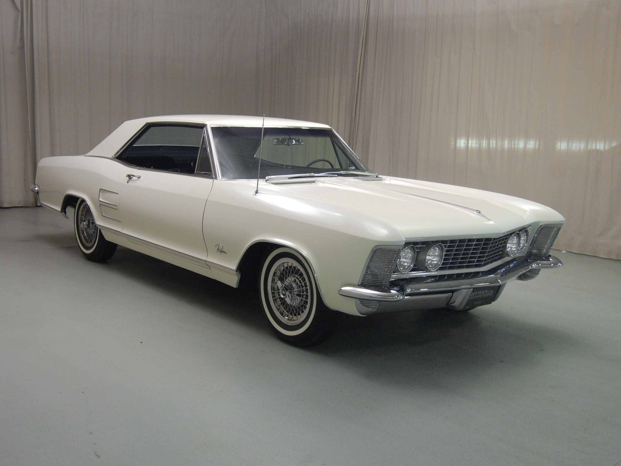
Design Analysis: First Generation Buick Riviera (1963-1965)
Ironically, it was Cadillac’s design and sales boom during the early 1960s beginning with one of Harley Earl’s (GM design boss until his retirement) last vehicles, the 1959 Cadillac Eldorado (think tail fins), which led to the Riviera seeing production as a Buick. Designer Jock Twombley intended and penned the Riviera as a Cadillac. But because Cadillac was on a hot streak, and perhaps more importantly because Buick was becoming a bit staid, the Riviera was given the thumbs-up as a Buick by Earl’s protégé and successor Bill Mitchell.
Looking to take GM in a different direction, Mitchell began moving away from Earl’s voluptuous forms and coined the term “knife-edge” design, referring to planar surfaces and transitions that were stiffly creased rather than gently rounded. Along these lines, the Riviera was meant to be GM’s personal luxury answer to Ford’s Thunderbird, which was growing larger every year and no longer very competitive with the Chevy Corvette. The personal luxury concept allowed Buick (as well as Oldsmobile) to approach Cadillac’s levels of extravagance without really decreasing Caddy’s market share.
Business analyses aside, the Riv was successful for one reason only: It was beautiful. The overall proportion is inherently elegant due to the length of the wheelbase relative to its greenhouse, and the long rear overhang. While maintaining a long, luxurious profile it still manages to look sporty because of the negative front end (it appears to be leaping forward) and the a-pillar’s position so far aft of the front axle.
In profile, much of the visual mass exists up front, speaking to the car’s large 401-ci (6.6L) V-8. However, unlike Cadillacs of the era, the visual mass increases again over the rear tires because of the flare in the bodyside and character line combined with where the c-pillar meets the body. The shape clearly speaks to the performance-oriented rear-wheel-drive of the car.
If considered candidly, the surfacing of the 1963 Riviera GMs isn’t that radically different from the models designed during Harley Earl’s twilight. The tautness that gave Earl’s cars their visual speed from the early/mid-1950s until his retirement is still very present in Mitchell’s Riviera (along with the rest of GM’s offerings). Mitchell may have stretched the surfaces a little bit more, but the main difference between the Riv and GMs five years older is the that the surface transitions are much sharper, the creases more crisp. You can immediately understand what Mitchell meant by “knife-edge” design if you compare the hood/fender transition on 1959 Buicks to the top of the Riviera’s front fenders.
Buick did away with the “Delta Wing” (their term, not mine) styling of the late 1950s and moved to much more restrained, tailored forms. Additionally, GM’s management tried to differentiate the brands more strongly to keep Buick and Oldsmobile from simply looking like decontented Cadillacs. This was accomplished by limiting detailing on all cars (which, happily, also saved some money).
The detailing that was included functioned to enhance the length of the car. For instance, the lower bodyside light catcher runs almost the entire length of the bodyside beginning with the front wheel flare and terminating in the rear bumper. The “Riviera” script between the front wheel and door accentuates the size of the front end. Perhaps the only questionable details are the ornate side pods that hide the headlamps on ’64s and ’65s. Don’t misunderstand, they’re not ugly, I’d only question their necessity in such a pure form.
By the time Buick was developing the Riviera, Mitchell was already in firm command of GM’s design studios. He was certainly a believer and product of his predecessor’s, but he was also keen on moving styling in his own, more modern direction. Along with the 1963 Corvette, the Buick Riviera made it clear that round, feminine forms were out and a sharp, muscular era was beginning.


