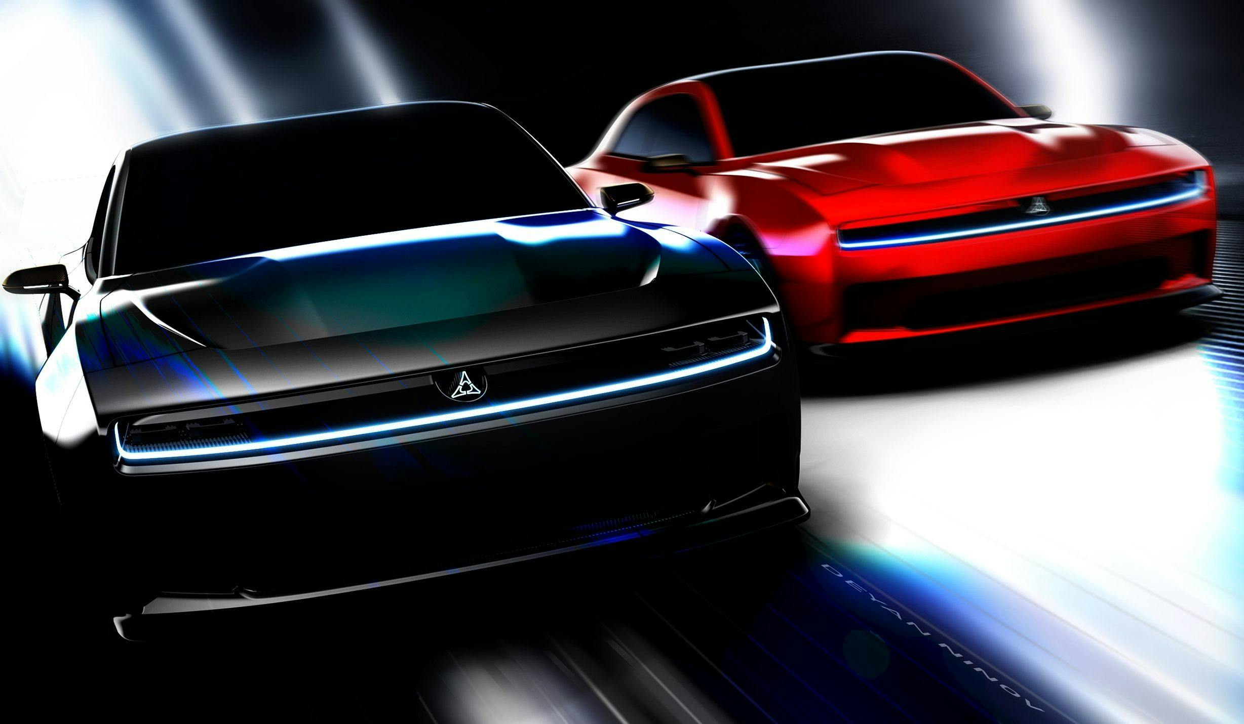
Our designer breaks down the Charger Daytona SRT Concept
One night over twenty five years ago, after a long drive to the north of England, I fell in love. The moment I knew was when I walked around the rear and saw the twin black stripes running between the tail lights. On the test ride I couldn’t stop laughing. The noise. The speed. The sheer bloody ridiculousness of the whole thing. Of course I bought it.
That car was a ’71 Duster 340 that you felt as much as heard before its Limelight bodywork punched your retinas out. Plymouth is long gone, but Mopar sibling Dodge has made a business of embracing this sort of gleeful anti-social behavior. Two fingers dipped in gasoline and flicked into a V sign.
The Challenger and Charger twins are doomed, in their current V-8 form, amid an automotive landscape whose masters no longer wants or understand them. Do you really still have a Dodge with its rumbling Hemi central nervous system ripped out and a humming EV one wired in? We might not have a definitive answer at the moment, but with the Charger Daytona SRT Concept we do have an idea at least what it might look and sound like.
Let’s start with the sound, because I don’t want to get bogged down in dubious gimmicks that have been covered elsewhere. I played that brief PR video (noise at 2:22) through my home stereo several times and it still sounded like a Kitchen Aid on the pulse setting whipping up a batch of margaritas, and not in a good way.
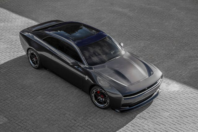
My old Duster and its Demon twin are not exactly the classic muscle car volume or shape—a bit short of hood and a little heavy at the rear, as a consequence of having to share a lot of sheet metal with the A-body. Although not constrained in the same way, this new Charger Daytona suffers from the same problem.
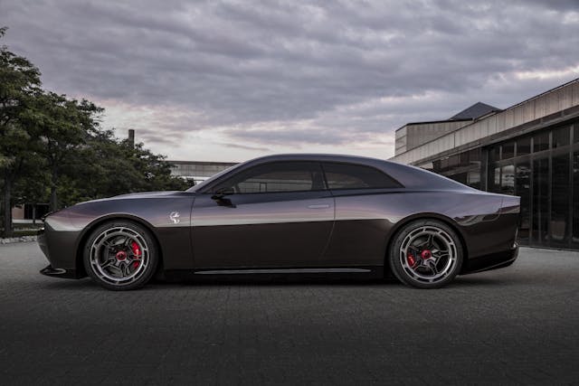
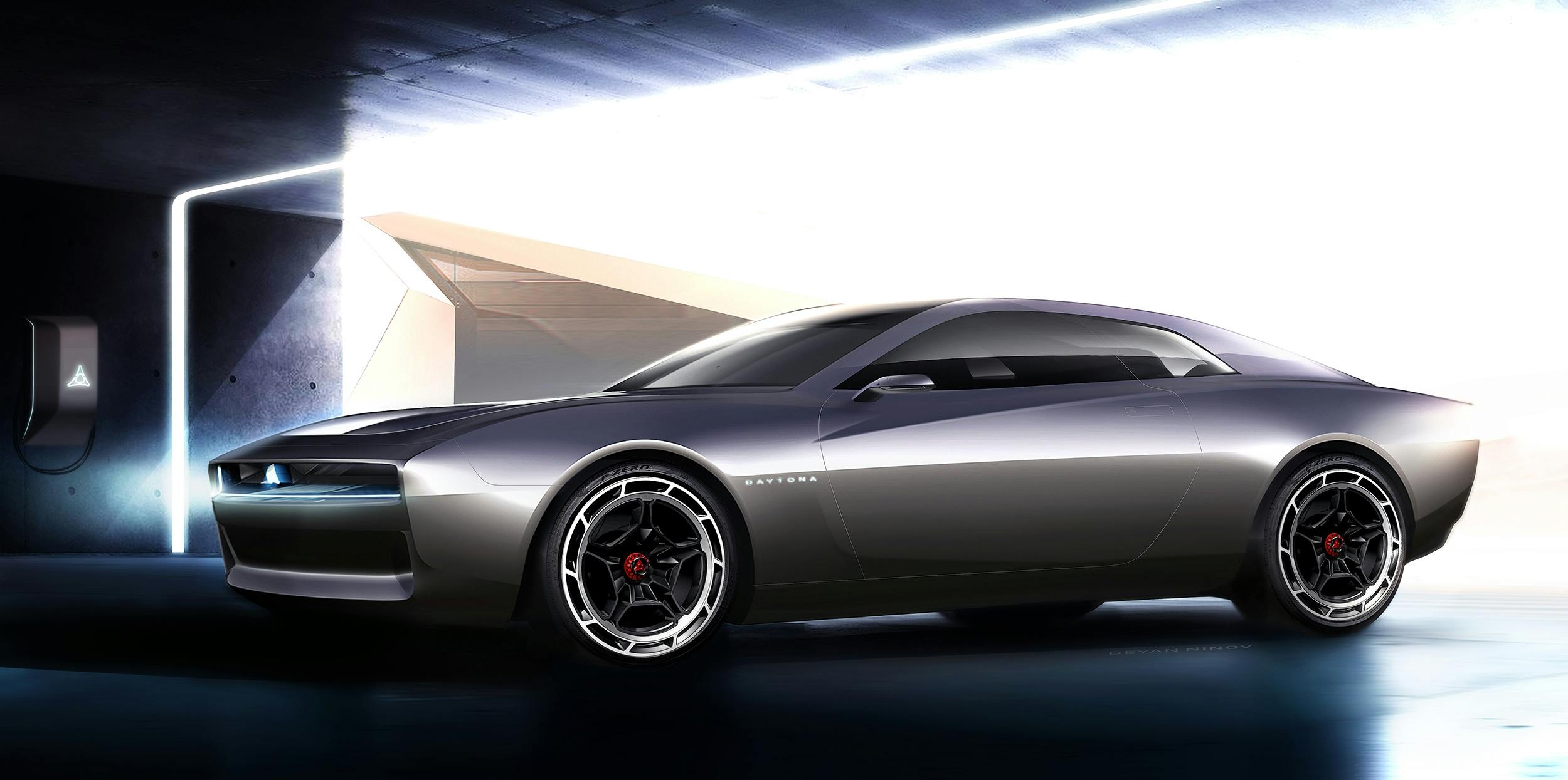
If we look at the side view, from the B-pillar forwards it’s reasonably successful. But behind that there’s too much side glass and the C-pillar stretches too far rearwards, pulling back the rear header rail and giving the passenger compartment a swollen feel. The reason for this is pretty obvious – it’s the proportions of a four door car but with only two doors.
The interior shows a full four-seat interior, which given the floor is probably stuffed with batteries explains why the whole car has a lot of body height. Remember, there are no free lunches; everything has to go somewhere. Start squeezing cells into the bottom and you push the passengers up. Although I watched the slightly juvenile and bombastic presentation online, there was very little in the way of useful information like dimensions.

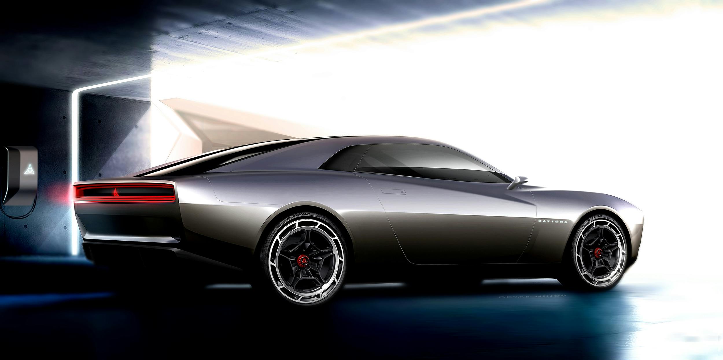
Switching to the rear three quarter view you can see this straight away: the concept is hunchbacked, and the tail looks stubby. A further problem with the view from this angle is it foreshortens how the nose drops away, making it appear truncated. In terms of the lines in the front third it looks a little bunched up and forced, which is a shame because this should be the most dynamic view of the car.
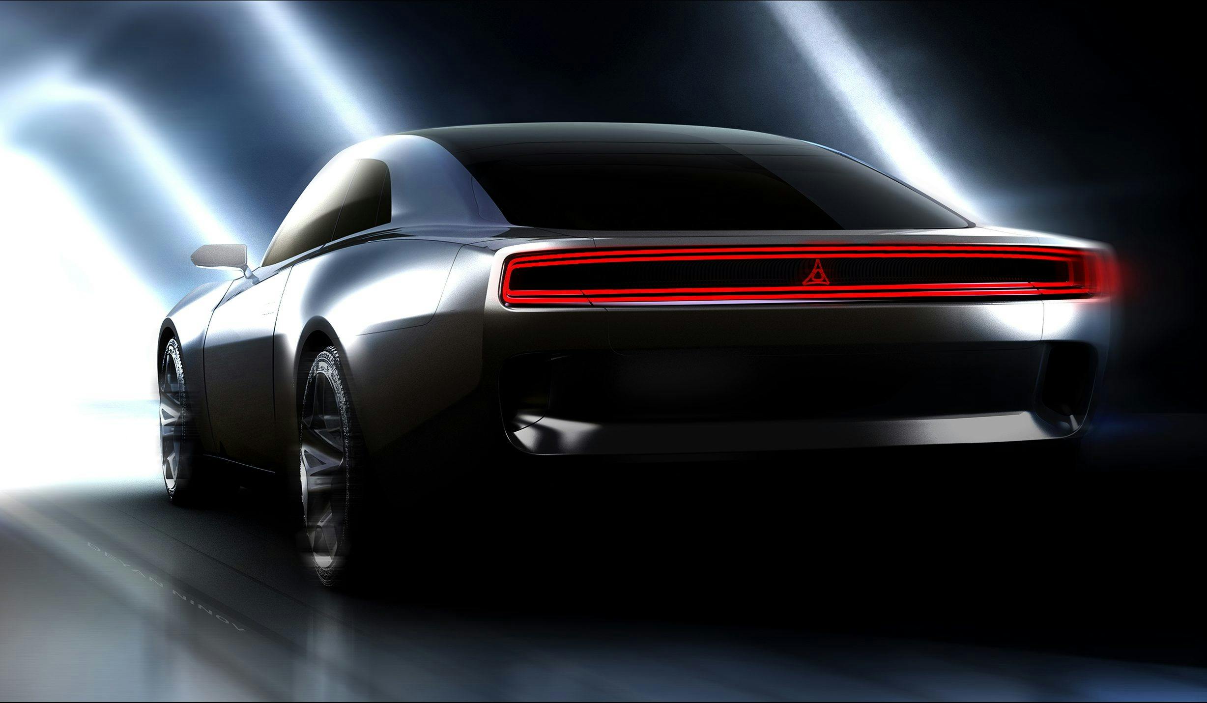
Dodge have tried to give the Daytona Concept a suitably menacing visage, and they’ve mostly succeeded. I’ve often spoken about the importance of the down-the-road graphic and how important it is in creating an identity for your car, especially in these days of enforced daytime running lights. The rectangular race-track lighting front and rear feels like a callback to the 1966–67 Charger. Considering the rest of the car is an update of the classic ’68–70 Charger, such mixing and matching of influences doesn’t always work. But with the simple shapes and forms present here it does. Look closely at the rear lighting; you can see it doesn’t quite line up across the shut line, perhaps because of a poorly-fitting tailgate. Hand-built one-offs, remember? On a production car you’d have a bigger gap between the elements to allow for a bit of tolerance so it wouldn’t be so noticeable.
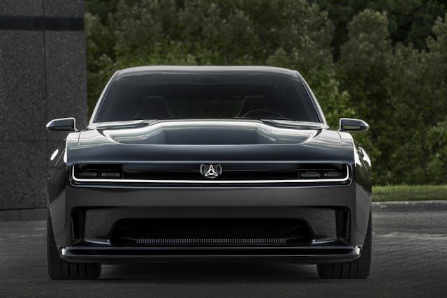
Much was made about what’s happening at the front, namely the “patent pending” R-Wing integrated into the leading edge of the nose. Jaguar did something similar to on the production I-Pace EV, but not to such a great degree. It’s a neat idea and extremely well done but I do wonder what the unforeseen consequences might be in terms of wind noise and spray in wet weather.
Iffy proportions aside, the surfacing is clean and restrained, with plenty of tension and a familiar shape. That last part is important, because perhaps more than any other OEM, Dodge has leaned heavily into its heritage for so long that it needs to keep meeting its traditional customers half-way.
Add in a pair of rear doors, wind in some of the detailing, and this is the next Charger. Look at the shut lines, especially around the front and rear bumpers. This is exactly how you would place them for a production vehicle. Although no mention was made of a frunk, you can clearly see a wider panel split to allow for over slam. The Daytona has normal door mirrors and the steering wheel looks like it already has a Mopar part number. There’s even a recess for a license plate on the rear! (How often do you hear the complaint that designers never think about such mundane details?)
Make no mistake, this is what customers are going to be getting. Whether they’ll like it remains to be seen.
Check out the Hagerty Media homepage so you don’t miss a single story, or better yet, bookmark it.
