The 20 best car ads of all time
If a car maker wants to advertise its shiny new car, more often than not it’ll turn to the internet to create a viral video to get people talking. But things used to be so much simpler—and cleverer.
We’ve looked back through the archives to a time when print was king, and was the way a car manufacturer could stoke people into visiting its local showroom and putting their hands into their pockets. Here are 20 of the best, cleverest, and most memorable car adverts that appeared in print.
Editor’s note: This article originally appeared on Hagerty UK. Though the marques featured in these ads are known on both sides of the Atlantic, most of these vehicles didn’t come stateside when new. There are a few familiar faces, however, and many models are now being imported by collectors into the United States. In the interests of balancing readability with authenticity, we’ve adapted phrasing and spelling to an American lexicon.
Mini: You don’t need a big one to be happy
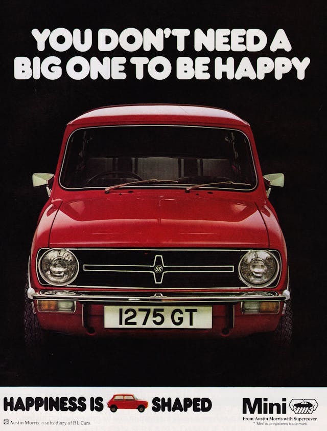
The Mini went through phases of being distinctly unloved by BMC and British Leyland, but one of the few moments when the Mini was in the spotlight was in the mid-’70s. BL unleashed a series of adverts that really majored on the Mini’s small size and cute character but delivered a big punch.
Stars like Eric Sykes were rolled out and some very clever marketing lines were created, such as “Nips in and out like Ronnie Biggs,” “Better in jams than strawberries,” and easily the most memorable, “You don’t need a big one to be happy.” The latter featured Carry On humor tied to some truth as the 1275GT was the sportiest Mini BL produced between 1969 and 1980, even if it was a poor Mini Cooper replacement.
Ford Fiesta XR2i and RS Turbo: Madras or Vindaloo?
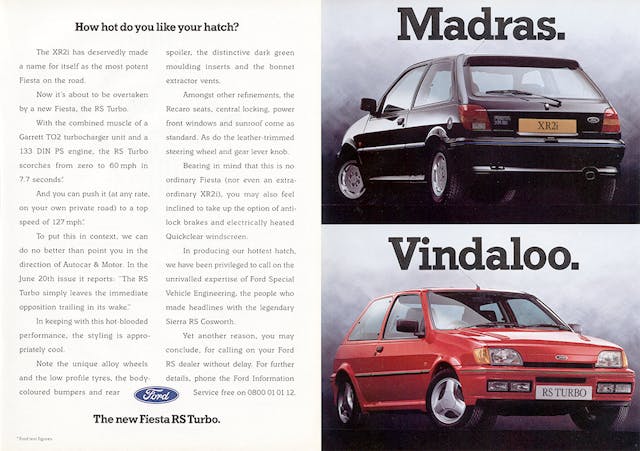
The XR2i and RS Turbo might not have been the best fast Fords ever made, but that didn’t stop The Blue Oval from trying to make them sound good. In 1990 it published an ad featuring the pair and posing a question to the reader: “How do you like your hot hatch?” It emphasized the fact that while some rival car makers only offered one sporty model, Ford customers could chose from two.
The fact that the XR2i had a 1.6-liter CVH engine that sounded like it was run on poppadoms at full-throttle and the RS Turbo was more jalfrezi than vindaloo didn’t matter: Here were two fast Fords and two spicy curries. A match made in heaven that only a Brit would understand.
Jaguar: V12
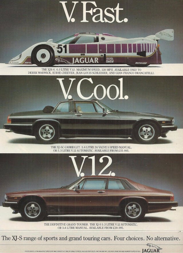
Jaguar founder Williams Lyons knew motorsport success could sprinkle magic on the showroom floor. The Le Mans victories collected by the C-Type and D-Type were proudly shouted about in newspaper ads, and even on the trunks of various Jag models in the ’50s. The British firm used the same tactic for this “V.memorable” 1986 ad featuring three V-12-powered models.
The XJR-6 (which nearly clinched that year’s World Sports Car Championship Drivers’ and Team championships) was powered by an enlarged 6.2-liter version of Jag’s V-12, and Jaguar made it very clear it was the same engine available in the XJ-SC Cabriolet and the XJ-S Coupe. Why Jaguar didn’t also feature the XJ12 saloon—thereby showing the venerable V-12’s sheer breadth of use—is beyond us, though.
Peugeot 106 GTi
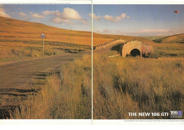
This ad is proof that sometimes images speak louder than words. Peugeot’s new 106 GTi burst onto the market in 1997, and along with its Saxo VTS brother arguably kickstarted a hot hatch craze not seen for a decade. While the soon-to-be-launched 206 GTi was the proper successor to the immortal 205 GTi, the feisty 106, with its 120bhp 1.6-liter engine and dinky dimensions, was the better car—and this ad sort of shows Peugeot knew that, too.
The ad itself even has a slight 1990s Volkswagen feel to it, but the airborne GTi is pure Peugeot in its humor and a perfect depiction of the French firm’s marketing slogan it used in the ’90s—”The drive of your life.”
Citroën 2CV

It wasn’t just Peugeot that could turn out a good advert; sister firm Citroën was pretty adept at it too. By the mid-’80s, the 2CV was over 30 years old and looking decidedly ready for retirement when compared to other small cars like the Austin Metro, Renault 5, and Ford Fiesta. But some clever positioning secured the car’s place not just in Citroën’s range but in the public’s mind too, with the car’s value-for-money and tough character highlighted.
This 1984 ad is a true classic as it rammed home the car’s basic credentials in a humorous way. At full-bore at 71.5 mph, of course the 2CV could overtake a Ferrari Mondial driving along at 65 mph. Just don’t ask what happens when there’s a rise in the road …
BMW: Shaken not stirred
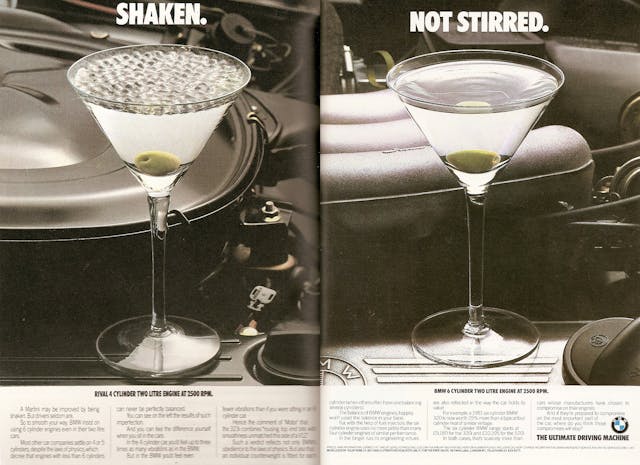
Hagerty readers and diehard BMW fans will know why the German firm favored six-cylinder configurations rather than four-cylinders in the 1980s, but did the man on the street? BMW reckoned the inherent smoothness that comes with a six-pot needed to be made clear to potential buyers, hence this ad.
The story goes that advertising magnate Robin Wright was told by a BMW engineer that if a glass of water was placed on top of a typical 2.0-liter four-cylinder engine—as used by Mercedes, for instance—the water would shake, whereas with a 2.0-liter six-cylinder BMW engine the water would stay still. Wright took the idea and visualized it—a glass (now a vodka Martini) on top of a Mercedes 2.0-liter four-cylinder engine alongside the same glass on top of a BMW six-pot. In so doing, he created one of the greatest car ads of all time.
MG: Your mother wouldn’t like it
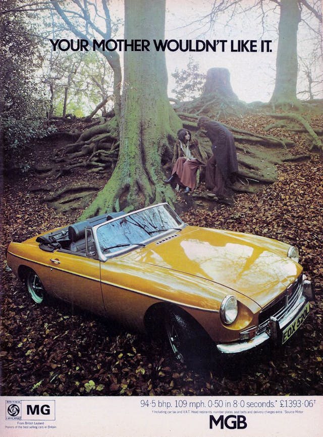
By the early 1970s, the MGB had turned 10 years old and that ’60s freshness was starting to look a little too familiar. British Leyland’s accountants had also begun to make their presence known by 1973 as the B’s shapely leather seats, smart chrome grille, and classic wire wheels were replaced with cheaper items, chipping away some of the car’s charm.
MG’s adverts took a different tone too. Gone was the respectable and upright “Safety Fast” slogan and in came something far more risqué. “Your mother wouldn’t like it” appeared on a series of MGB ads and it became a bit of a catchphrase. BL returned to the questionably sexist approach a few years; to market the rubber-bumper B it used the line: “Some day you’ll settle down with a nice, sensible girl, a nice, sensible house and a nice, sensible family saloon—some day.”
Audi – Can’t stop driving
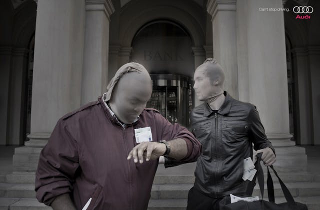
Audi has a strong back-catalog of great ads and wasn’t scared at making it clear what type of driver bought its cars. From the mid-’90s TV ad that showed a hangover-from-the-’80s yuppie rejecting the discreet new A4 20-valve saloon because “it’s not my kind of car,” to this 2009 print ad showing a failed bank robbery.
Just like the Peugeot 106 GTi ad already featured in this list, this ad shows that paragraphs of soppy copy aren’t always needed. Whether you believe Audis are the choice of getaway drivers or not, and no matter your opinion on the driving excitement of one, it’s an ad that delivers a memorable message and image.
Land Rover Freelander
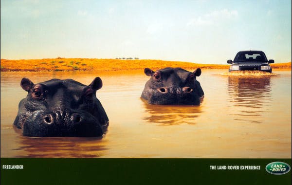
Much like Peugeot, Land Rover took a “picture paints a thousand words” approach with its ads in the late 1990s and early 2000s. It published a series of ads in mags and newspapers that relied on a strong image and no gushing ad copy at all. The adverts gave a sense that the products themselves were so well-known that they didn’t need to be sold to the viewer.
It’s hard to pick the best, because some of the ads for the Defender and Discovery border on the downright clever, but our favorite has to be one for the Freelander. It’s simply two hippos swimming and a Freelander that’s also showing off its breaststroke competence, but the message is clear—the Freelander is a true Land Rover and can easily ford every stream. The fact that the Freelander actually looks like a submerged hippo is also nicely self-deprecating.
Volkswagen Polo: Small but tough
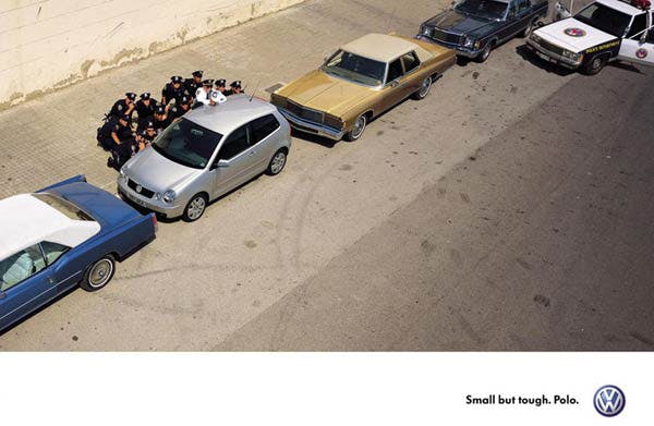
With the launch of the Mk4 Polo (or “9N”) in 2002, Volkswagen had established its image of being a car company that built reliable, dependable, classless cars that had superb build quality—a direction the brand had begun with the Mk. IV Golf. The “Small but tough” Polo adverts fitted perfectly with this new, cool, and confident Volkswagen of the early ’00s.
But it was such a strong marketing slogan that in 2005 VW found themselves fighting off critics for a supposed TV advertisement that showed a suicide bomber detonating a bomb inside a Mk4 Polo outside a packed café, ending on the “Small but tough” line. It was later discovered the ad was created by two young ad execs, outside of Volkswagen, who were pitching for work. It was never meant to be seen. VW later threatened legal action and the ad was handed over to the company, but a copy still resides on YouTube. If anything, it showed how simple and powerful the original “Small but tough” print ad really was.
Vauxhall Cavalier: 4×4 = Grip
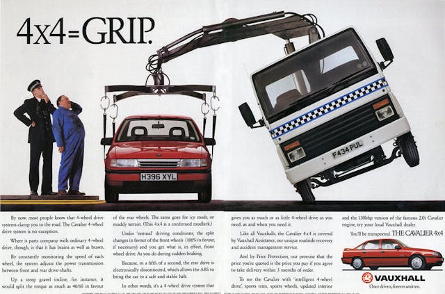
The Mark 3 Vauxhall Cavalier came in a wide range of trims that would have pleased ladder-climbing middle management types in the late ’80s and early ’90s, but would confuse buyers of today. There were Ls, GLs, CDs, Diplomats, SRis, and GSis, which all came in a designated hierarchy, but the simplest of them all was the 4×4. It did what it said on the tin, but it was perhaps the most unusual of all the Cavaliers. Like its Ford Sierra Sapphire rival, here was a normal family saloon car with four-wheel drive—normally the preserve of expensive Audis.
This ad from 1990 set out the 4×4 Cav’s credentials in a bold way, even if the image made the car look heavy rather than grippy. The copywriter had a free hand at artistic license too, purporting that the Cavalier’s four-wheel drive system—which came with a 60/40 split in favour of the rear wheels from a 130-hp 2.0-liter 8-valve gasoline mill—could help the mid-range Vauxhall in “muddy terrain,” making the car a “confirmed mudlark” …
Fiat 500
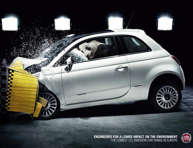
When Fiat brought back the 500 in 2007 to mark 50 years since the launch of the original, it sparked a deluge of special editions over the next 13 years and most had a cutesy ad touting the car’s retro style. One of the less-known promotions, but easily the cleverest, was its 2009 campaign highlighting the car’s green credentials.
Three ads were created that showed a 500 being crashed in a stunt similar to the EuroNCAP test. Look closer, however, and you’ll see there’s no dummy at the wheel—but an animal. Depending on which ad appeared in your magazine at the time, it was either a panda, a walrus, or a couple of penguins. Accompanying the unusual imagery was the tagline: “Engineered for a lower impact on the environment—The lowest CO2 emission car range in Europe.” The fact that the animals were perfectly safe in their 500 also gave the ads a double meaning. Subtle and clever.
Rolls-Royce
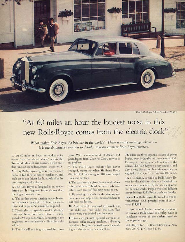
Throughout the first half of the 20th century, Rolls-Royce’s adverts tended to follow a similar pattern—stuffy. They quite often featured a large image, normally an artwork, showing a Rolls-Royce model parked in front of a stately home, under the headline: “The best car in the world.” That was until 1959 when a man called David Ogilvy ripped up that formula and created one of the greatest car ads of all time.
Ogilvy, an advertising mogul and Rolls-Royce fan, turned the “best car in the world” statement into a question, and made the ad explain why. The imagery became more informal and quite often pictured a family instead of an awaiting chauffeur. Ogilvy coined probably one of the most famous lines in automotive advertising history and one that has stayed with the luxury car marque ever since: “At 60 miles an hour the loudest noise in this new Rolls-Royce comes from the electric clock.”
Peugeot 205 GTi
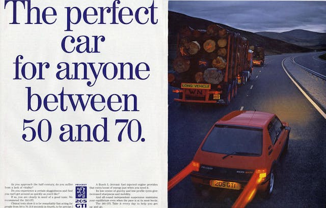
A series of clever 205 GTi adverts in 1987 used age as a key theme, and tackled the notion head on that Peugeots were driven by sensible, mature types. The ads used the headlines “Sticks to corners. Takes some licking. (They ought to commemorate it on a stamp)” and “The 205 GTi demonstrates its traditional skills”—the latter showing the 205 “weaving” through a slalom course, tackling a forest track (“woodturning”) and, in a sly dig at the Fiesta XR2i, outpacing the Fiesta under the title “Taxidermy.”
Perhaps the cleverest was the ad that carried the headline: “The perfect car for anyone between 50 and 70.” The copy suggested that at this time of life the body starts to slow down, but the picture showed how ideal the GTi was at overtaking between 50 and 70mph.
Volkswagen Golf GTI
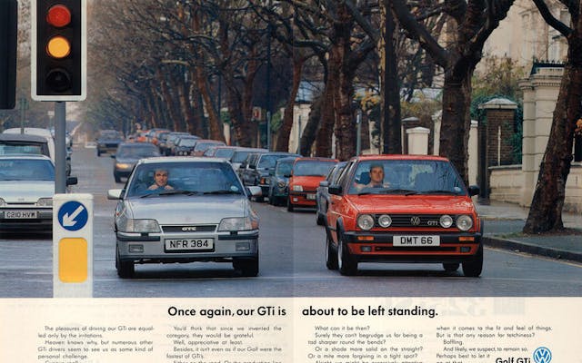
From one GTi to another GTI, Volkswagen’s Golf GTI ad of 1989 took a different path from Peugeot—and indeed all other car makers making GTI equivalents. This ad nabs a space in this top 20 because it beautifully epitomizes not just VW’s talent for producing a great advert, but also brand values by which the company still lives today.
The ad clearly shows a Vauxhall Astra GTE with its driver itching for the lights to turn green, and we know, thanks to the ad copy, it’s a traffic light race that Grand Prix Astra man will win because his car is faster. But in mocking its own car for being slower, Volkswagen cleverly emphasizes the fact its car is “sharper around the bends,” “more solid in the straights,” and put together better with a tighter “fit and feel.” In four small columns of copy, Volkswagen created a template which all Golf GTIs would follow: They might not be the fastest but they’re the best all-rounders.
Citroën BX 16v
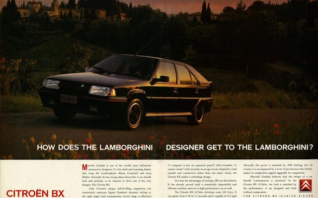
While the 2CV ad was all about truthful humor, the BX 16v ad of 1989 showed Citroën could do arty and glossy too. This printed ad was joined by a television one that really upped the drama by using Vivaldi’s Four Seasons as background music. Both feature Marcello Gandini, the famed Lamborghini designer who penned the Miura, the Countach and, as the ad neatly hints, the soon-to-be-launched Diablo.
Why? Well, Citroën wanted to make it clear that Signore Gandini also designed the BX, and it has to be said that, painted in black with the ’80s de rigueur red stripe on the bumpers, the 16v (which had just replaced the BX GTi) looked rather good. The headline is also very Volkswagen and has shades of VW’s classic Beetle ad which used the line: “Have you ever wondered how the man who drives a snowplough gets to the snowplough?” It’s unclear whether Gandini ever drove a BX 16v to work, though.
Volvo 740 Turbo Wagon
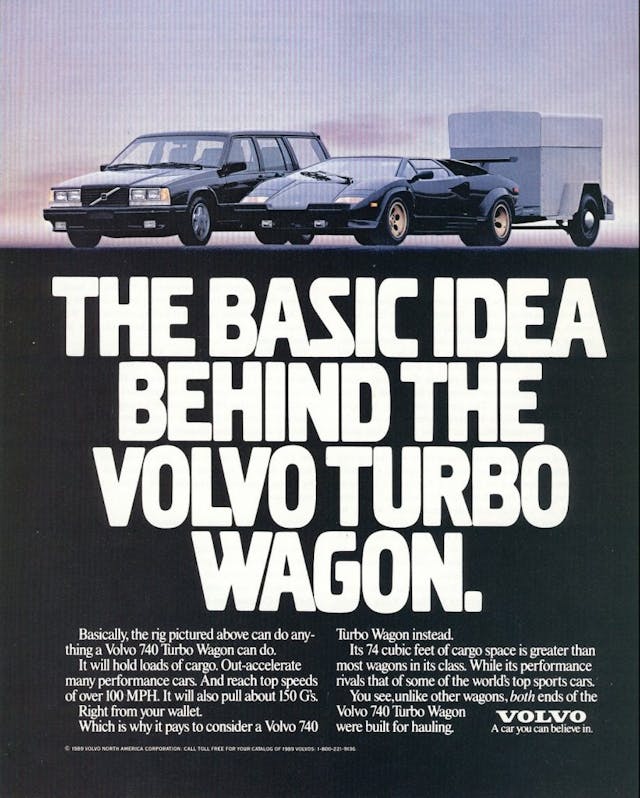
The Lamborghini Countach made an appearance in another ad in the 1980s, but this time around it was more comical rather than truth-based. Although the Lambo’s name is never mentioned specifically, the meaning is very clear—Volvo’s new 740 Turbo estate (sorry, wagon, this is an American ad after all) is one fast wardrobe. Volvo wasn’t done with the analogy either because it created another print ad and a TV ad using the line, “Until Ferrari builds a wagon, this is it.” The firm also used the same setup with a Porsche 944 and the headline: “To a radar gun they look exactly alike.”
During the 1980s, Volvo’s advertising strategy was really on point, with strong imagery and even stronger humor, all topped with Volvo’s classic “Volvo Broad” font. Other classic Volvo ads of the time included, “The Volvo Turbo as most commonly viewed from a BMW 318i,” “At last, an irrational reason to buy a Volvo,” and “The world’s fastest baggage handler?”
Skoda Fabia
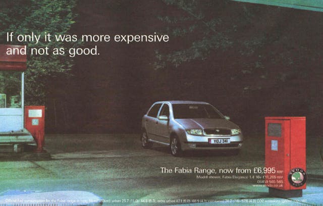
It’s fair to say no car maker has tackled its brand perception so hard as Skoda. In Britain the Czech brand had a real image problem in the ’70s and ’80s, and despite Volkswagen snapping it up in the early ’90s, buyers still kept away. By the later part of the decade, Skoda was churning out some seriously good cars in the shape of the Fabia and Octavia, but instead of wooing buyers with adverts boasting of how good the cars were, Skoda took a different tack.
Much like Volkswagen did in the 1960s, Skoda used its underwhelming reputation as a way of supposedly laughing at itself, but really it was sewing the message that its cars were rather good. It worked, too: Sales took off in the early 2000s and for a time Brits liked the inverse snobbery—something which Dacia would also later enjoy.
Daihatsu Hijet
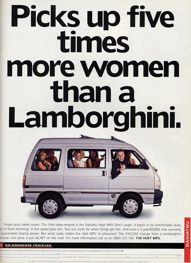
Making comparisons with Lamborghinis seems to be common practice in the world of automotive advertising. Perhaps the funniest—and certainly the most memorable—was Daihatsu’s 1996 ad for its new Hijet. We can only guess at what a headache the very unsexy and very Japanese mini MPV caused the ad agency, but the resulting ad was a modern classic.
The bold headline, the cheeky image, and the suggestive language relating to the reclining seats was distinctly British in flavor, and it could easily have been an ad from a couple of decades prior. A great ad it might have been, but it didn’t translate to sales. The Hijet disappeared from dealerships shortly afterwards, and Daihatsu withdrew from the U.K. market some 15 years later.
Volkswagen Beetle
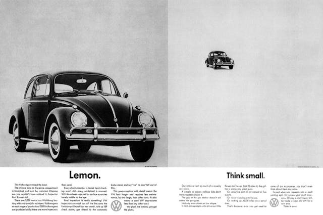
We’ve left arguably the best, but certainly the most famous car ad of all time, for last. Volkswagen’s 1959 “Think Small” U.S. ad, which showed a tiny Beetle and three columns of copy, was more self-deprecating than salesy. Ad agency DDB didn’t want to waste effort in advertising Volkswagens to Americans only interested in “Yank Tanks,” so it concentrated its efforts on creating ads that showed Beetle ownership to be like a club, encouraging owners to effectively be brand ambassadors for VW.
“Think Small” arguably changed car advertising forever, and throughout the ’60s (and well into the 2000s), every Volkswagen ad followed the same style—but the most famous was “Lemon.” When readers of the magazine in which the ad appeared in turned the page, an explanation was given as to why this Beetle was a lemon—the chrome strip attached to the glove compartment lid had a blemish, apparently. The ad copy went on to describe that this “lemon” had been fixed by one of VW’s 3389 quality control inspectors, and finished with the now famous line: “We pluck the lemons, you get the plums.” The ad was so groundbreaking that the term “lemon” to describe a car that’s faulty or sub-standard is still used today.

