Smithology: A little too on the nose

No one cares what I think of the styling on the new BMW M4, so I won’t tell you.
I will go out of my way, in fact, to avoid telling you: that the car in question resembles nothing so much as a gin-drunk and particularly angry rabbit with a hellacious overbite; that its comically large grille openings fail to cohere with the car’s (not entirely unappealing!) various lines and forms; that the whole mess reminds me of that moment, several years ago, when I woke in the middle of the night and looked over the side of the bed to find my bean-brained but lovable spaniel, Elly, whimpering because she had accidentally jammed her jaws open around one of those rubber Kong chew-toy things that she loves so much.
(Good dog. Nice display of teeth. Maybe not a good look for a car.)
I will especially not share the part of my opinion that details how the front of said BMW is shaped like the jagged and vaguely geometric hole behind a human nose, the one visible only when a person’s skull is stripped of flesh and entirely dead.
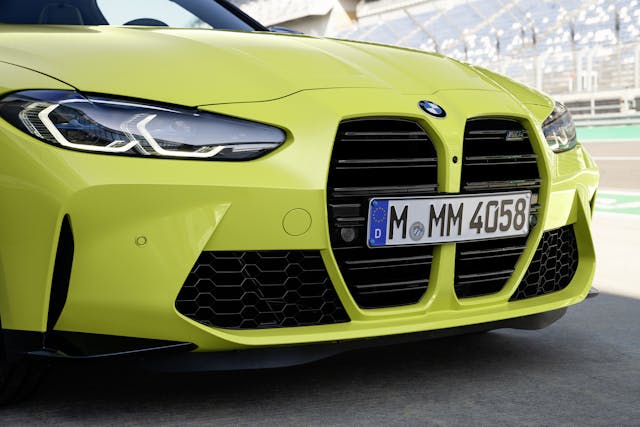
Nope.
What I will do, however, is take a moment to discuss automotive styling. Hold your applause.
After almost two decades as a journalist and automotive writer-person-about-town, I have learned a few things about the building of automobiles. More to the point, I have had many skilled design people explain to me at great length the process of creating a new car, usually while I ask a series of stupid questions. (Never underestimate the usefulness of a stupid question. Stupid questions are often simple questions, and asking someone to pull an idea down to its core elements often reveals much about the person doing the answering.)
People who love elegant old cars tend to think modern car designers are simply bad at their jobs. This is often true. But here’s the interesting part: Some of those designers are actually quite good at what they do in spite of the fact that their work is widely loathed.

Half a century ago, most carmakers were free to simply design a new vehicle within constraints of packaging and aesthetics while worrying about little else. The modern version of the game is far more complex, and so the people who play it tend to speak rarely of beauty but often of compromise. They concern themselves with how a design can be of the moment but also capable of outliving fad, with how certain shapes and lines can trick the eye, with the difference between an inelegantly brutal shape and a brutally elegant one.
Below, a series of truths. Prompted largely by the fact that the new M4 was shown to the public a few weeks ago, hailed as revolutionary, and widely reviled.
Design Truth Number One: Everyone’s a critic. This doesn’t matter. (Save the part where you maybe buy a car. But possibly not even then.)
Humans are never so convinced of anything as the validity of their own taste. I like this; you like that; you tell me I am wrong, and you are almost certainly incorrect, because what do you know about what I like? But then you’re also right, of course, because you know what you like.
At the core, your taste is simply your natural inclination. And ultimately, a design’s cohesion is far more important than whether it suits your taste. A stylist at Porsche once told me that, although people will and often do buy a cohesively styled object that they don’t love—you’d be amazed how often new-car buyers feel forced to settle—it’s more difficult for someone to accept a design that doesn’t seem all of a piece. (Example: Nobody gets excited about this, but there’s probably not an awkward line on it. Compare with this, which is almost certainly a much greater sin of form.)
In other words, in the absence of a perfect solution, most people will choose indifference over active dislike. Which makes sense.

Years ago, I worked as an associate editor at Automobile Magazine. This was back when magazines had large staffs and could afford to retain people with lofty titles like Design Editor. Automobile’s captive designer in that role was the great Robert Cumberford, a lovely and opinionated man who once worked at GM under the legendary Harley Earl. Cumberford wrote a recurring feature, By Design, where he dissected new-car styling—how this line helps that one, why a shape might appear heavy or light, the nature of visual language, and so on. The science of form.
Cumberford was extraordinarily patient with uneducated questions, to say nothing of eloquent, so I took every opportunity to ask him about his business. The best thing I ever heard him say was, “It’s a good design. That doesn’t mean it has to be pretty. Or that you have to like it.”
Design Truth Number Two: Every new car is a compromise, and that compromise grows more difficult every year.
Even at their smallest, car companies are still … companies. They work somewhat like movie studios, orchestrating the efforts of a large number of people in order to blend a certain amount of engineering with a modicum of art and a bit of profit. The average new car takes several years to create, from first drawing to Job One. It is the result of millions of engineering and marketing dollars and an attempt to satisfy hundreds of needs and literally thousands of masters.
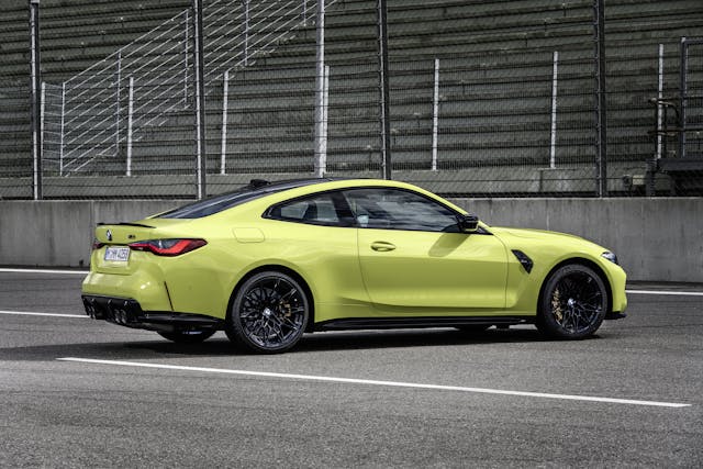
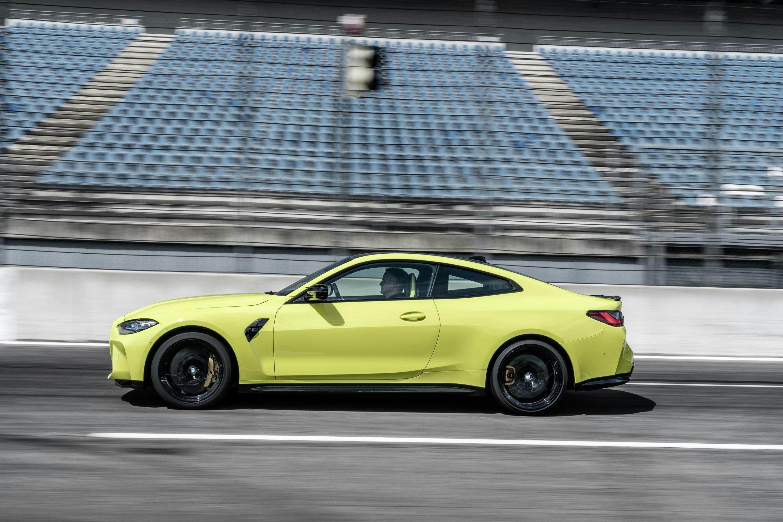
Some of the pressure points are obvious: ever-increasing federal regulatory minimums for everything from emissions to sun-visor placement. Ever-increasing market standards of power and comfort, which demand an ever-rising waterline of average vehicle weight and relative complexity. But every new-car design is also the result of a push and pull between stylists and engineers. A platform’s component set consumes too much space, or too little. A high-ranking executive likes the uglier of two prospective design options. A designer wants a fender shaped like this, to reinvent a norm or push the company forward or stand out in the market or simply make some good art, but an engineer needs more brake cooling or aero trickery, or a production team can’t meet cost targets, so the final car is shaped like that.
The movie critic Roger Ebert was once asked why studios “let” bad movies get made. By way of response, Ebert laid out the myriad things that had to go right before any film saw theaters. His list included everything from finance and production insurance to whether the final-cut editor had a drinking problem. “Given everything that can go wrong,” he said, “it’s amazing any movie gets made at all. The fact that some of them are good—or even excellent—in spite of that? A miracle.”
In other words, if a car turns out yuck, blame the whole company, not just the guy who chiefed the sketchbook. Nor is the answer behind a failure ever simple; with cars, at least, books have been written about the how and why.
Design Truth Number Three: The focus group is useful, except when it’s not.
Because cars are so expensive and time-consuming to create, critical choices are often focus-grouped. Small reference groups of consumers are brought together or surveyed, their reactions to new ideas logged and analyzed.
Focus groups can confirm good, but they can rarely generate it. Sometimes they give you… this.

The dowdy, rump-faced Pontiac Aztek was famously a result of management trusting focus-group answers (positive, we like it!) against the opinion of experienced and senior company personnel (it’s hideous and stupid!) A focus group that can make you believe absurdities can make you commit atrocities: Fifteen years ago, Jeep took the relatively normal step of putting two different ideas for their first FWD box into the groups for review. The Compass looked like Hello Kitty; it was favored by female focus groups. The Patriot looked vaguely like an XJ-chassis Jeep Cherokee; it was favored by male groups. Which should they pick? The answer was obvious: Let’s do both! This was not the most business-savvy thing the firm had ever done, to put it mildly.

File all of this under the old adage that most of humanity doesn’t know what it wants until someone shows them. Along with the corollary that the person doing the showing has to know exactly what they’re doing. When Led Zeppelin’s eight-minute-long “Stairway to Heaven” was released, music-industry consensus held that no song that long would do well on the radio—the drums didn’t even appear until four minutes in. Shortly after, the tune became a staple of AOR radio and one of the most broadcast pieces in the history of popular music. Similarly, before the Jaguar E-Type, no road car had looked as much like a sexually charged cucumber, and some in Coventry legitimately wondered if the thing was a bridge too far. It wasn’t. But the Aztek was.
Design Truth Number Four: If a person styles a new car and said car is widely perceived as hideous, the stylist already knows.
For that matter, this person was probably aware of that it before anyone else. They might even agree with that general opinion. Designers are almost always car people, and almost always in love with the classics—your early 911s, your split-window Corvettes, your Bugatti Atlantics and McLaren F1s. They will talk about these cars ad infinitum and with great enthusiasm. Most of them Get It, even if their work doesn’t convey that message to you.
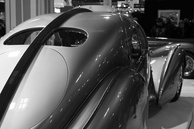
This “getting it,” however, does not mean that these people are always given freedom to work. (See Truth #2, above.) It’s cold comfort, but know that they understand the problem.
Design Truth Number Five: New vehicles almost always succeed when born with a face that recalls a giant and gutter-drunk aggro-rabbit.
One of the tenets of classic design, really. Nothing throws a customer into the showroom faster than picturing the Easter Bunny’s bucktoothed schnoz after a long and toxic night of binge-pounding PBR tallboys in some dive bar with cork on the walls.
Pretty sure they said the same thing half a century ago, about the E-Type, really. Or any classic beauty. Helen of Troy’s face was awfully rabbity, you know.

In the end, the problem with automotive styling is that while beauty sells, ugly also sells. The E-Type sold. The M4 will likely sell. Even if the latter jumps out of dealers, however, something has been lost. There was a chance here to make an objectively gorgeous car, and in the long run, the choosing of another path will matter. Ugly is like noise. It wears you down. It’s the concrete cube of a plaza where there once was grass and flowers. It’s an involuntary frown from a street corner, sandpaper for the soul. One more piece of the world that suggests or leans toward blunt brutality, and few would argue that we don’t have enough of those.
Or that’s how I’m wired, at least.
But hey. No one cares what I think of the styling on the new BMW M4, so I’ll stop telling you.

