Vellum Venom: 2005 Maybach 57
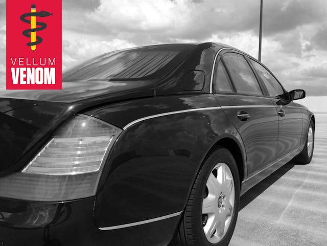
Was the 2002–2012 Maybach the first coachbuilt luxury sedan of the modern era? These streamlined lines made their debut in a 1997 concept that likely forced Rolls Royce/BMW’s hand in reintroducing the Mack-truck shaped 2003 Phantom. But a Maybach sighting for people of a certain age instigates an uncontrollable urge to utter that music “drop” spoken by model Jessica Gomes. For those who m-m-m-may not know the reference, a famous record label also sports the Maybach name and likely became the brand’s most valuable ambassador.
Sales volume never justified the bespoke coachwork, which was loosely based on the Mercedes-Benz W220 S-Class. Plus, this example’s modest $43,000 current asking price suggests that Maybachs are now fully depreciated, future classics. No better time for a run on the vellum!
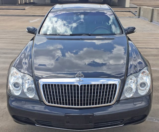
While the windscreen and fender bubbles (near the headlight) are similar to Mercedes-Benz vehicles of the era, the exaggerated hood width/height suggest this is far from a badge-engineered upgrade. This and much more differentiates this Maybach flagship from the new W222 S-Class sedan sporting an upscale Maybach trim level.

Lighting pods with monstrous amounts of non-functional chrome were commonplace in this era, but few made their presence known like the four-eyed Maybach. The contrast from a simple waterfall grille to those insect-alike eyeballs is shocking, a sad contrast to the dowdy lower bumper that looks more at home on an E-Class taxi.
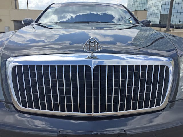
Zoom in on the grille, specifically the hood ornament and the hood bulge. Imagine what could be if every other element was as sleek, streamlined and striking. Note how the vertical grille teeth are set behind the chrome frame, except for the center “spine” which sports rounded curves as it nears the hood ornament—the fact that this texture didn’t carry on to the current Maybach is tragic.

This logo’s entomology ranges from bizarrely sinister guesses to logical assumptions: The two Ms likely represent the company name (Maybach-Motorenbau GmbH) circa 1912 or its founders, Wilhelm and Karl Maybach. No matter—this pre-war design has a minimalist Bauhaus-ian style that likely influenced VW’s logo years later.
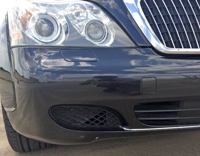
The bumper feels too thin and fragile for the visually massive details above.

Fog lights aren’t normally implemented for luxury sedans, but blocked-off grille teeth are awful at any price tag. Even a depreciated one.

This blocked-off paneling is better implemented via the center’s horizontal lines, especially with the lower chrome strip. The absence of this shape/texture at the adjacent ovoid is unfortunate.
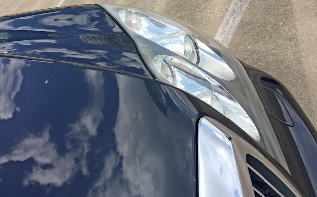
Speaking of ovoids, the headlights are amorphic from every angle. It was a sign/shape of the times, but at least it looks like no other vehicle on the planet.
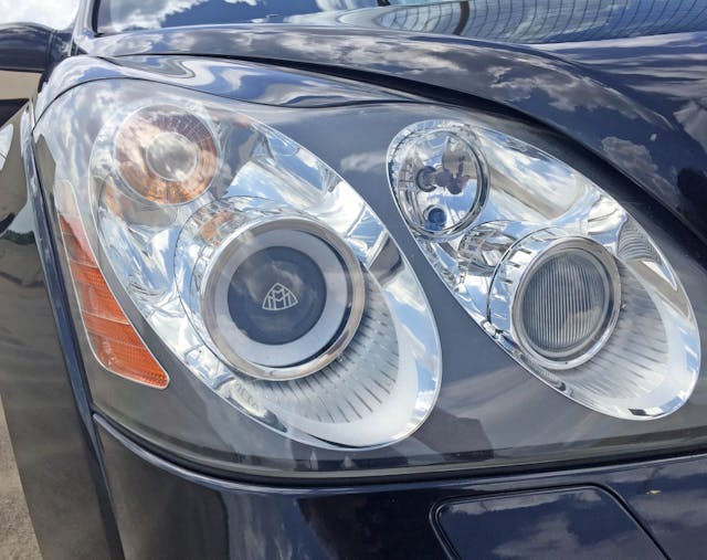
The actual lighting bits are well finished, but amoeba shape pulls farther back at the corners while adding no functional value … not unlike the face-lifted 2001 Hyundai Sonata.

The brilliant chrome HID lens with the Maybach logo, rough chrome accents, and SLR-camera-lens shapes make the headlight’s guts more impressive than its external case.

Fenders that emulate the unnecessarily amorphic headlights were a Mercedes hallmark. Thank goodness this trend disappeared.
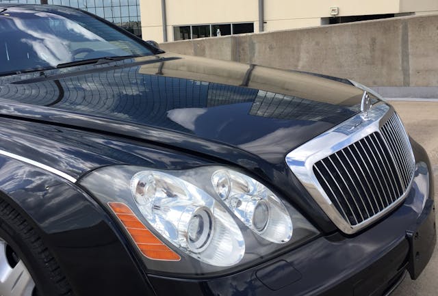
Admittedly, the headlight blobs do add excitement to the stodgy grille and neoclassic fender trim. The lights flow with the grille/hood’s forward thrust and conform to the front end’s taper.
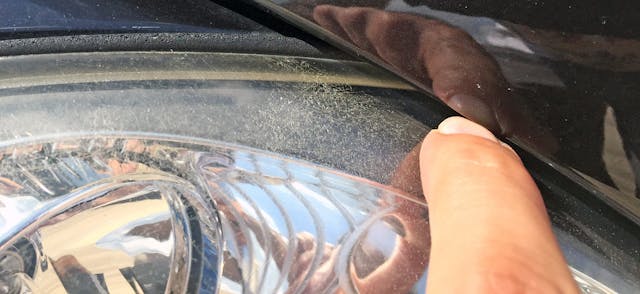
The massive hood rests atop the fenders, suggesting the engineering underneath is standard W220 Mercedes. Still, the gap presented is truly appalling.
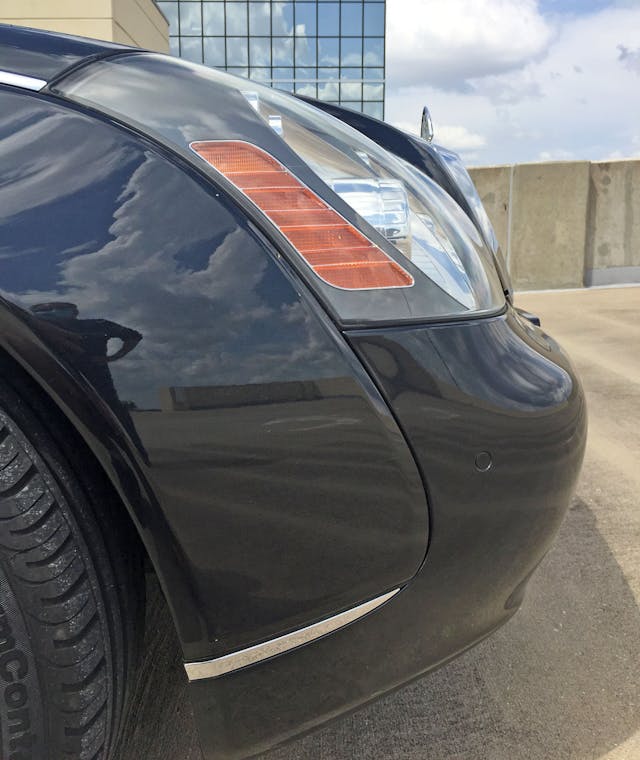
The amorphic headlights make far more sense from the side; their shape completes the curve that starts at the bumper and ends atop the fender. Even the amber turn signal complements the body contours, but it’s a shame the chrome fender trim lacks a horizontal component to create a frame around the body’s center section.

The low-slung radiator support, modest hood ornament, and the general tidiness stemming from W220 architecture ensures nobody mistakes the Maybach for a Rolls-Royce. Still, it’s properly luxe: The space between the wheel and the cowl (the dash-to-axle ratio) is reasonably wide and luxurious. (This is one area in which Rolls-Royce unquestionably excels.)
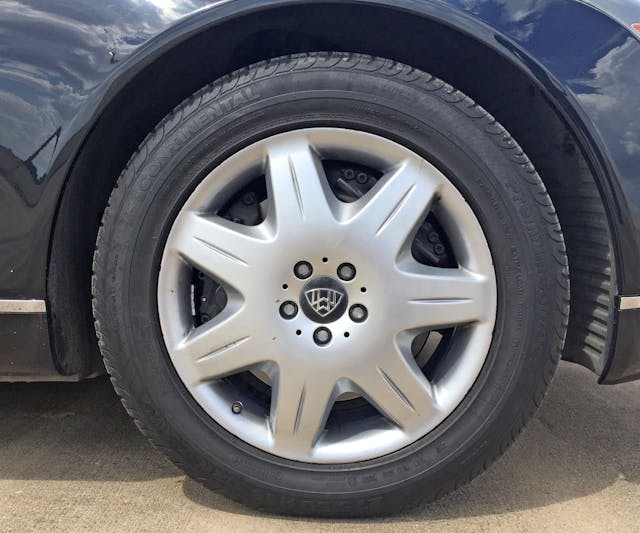
It’s surprising that chrome or polished wheels weren’t standard, even on the entry-level 57 body style. These 19-inch wheels are almost tiny by today’s standards of luxury and sport a silver-painted spoked design so subtle that the twin brake calipers are barely visible.
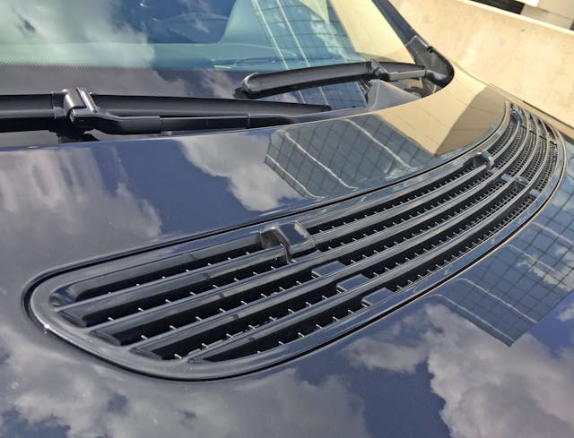
Remember that long dash-to-axle ratio mentioned above? It’s more impressive because the cowl extends past the grilles mounted within the hood: While shared with the W220 S-Class, these grilles are cast normally into the cowl and share space with the wipers.
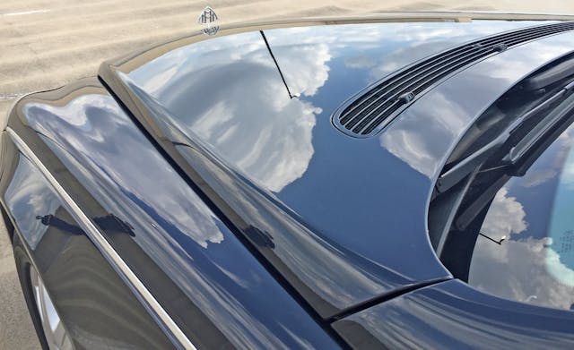
From here the low-slung nature is overridden by the luxurious hood bulge, voluptuous fender, chrome fender spear, and that prestigious Maybach h-h-h-hood ornament. It’s sleek, but far classier than the W220 from whence it came.

The hood/fender/door/A-pillar meeting point has too many lines, but they all flow in complementary directions. Too bad the hood gap remains larger than expected.

Maybach’s bodyside heavily diverges from the S-Class engineering: Doors are taller and more upright, mandating a unique roofline. All lines flow from front to back elegantly (thank you, chrome spears) and cleanly—few lines fight the rearward flow.
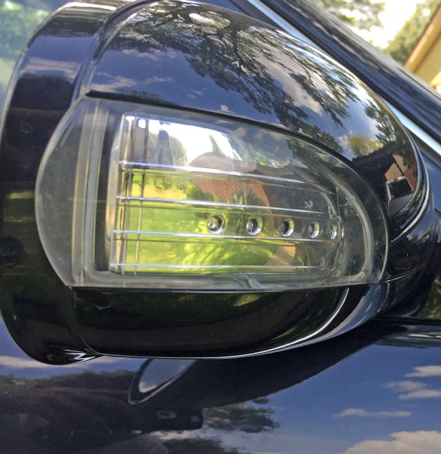
That not to say the design is timeless, because lighting technology of the 57’s era looks significantly cheaper and cheesier than its modern counterpart. The sheer volume of raw chrome paneling presented here looks more at home on a Kia Amanti.

This Maybach 57 lacks the once-radical panoramic roof of the long-wheelbase 62. Note how the roof is a modular unit, independent from the “hoops” containing the door apertures.
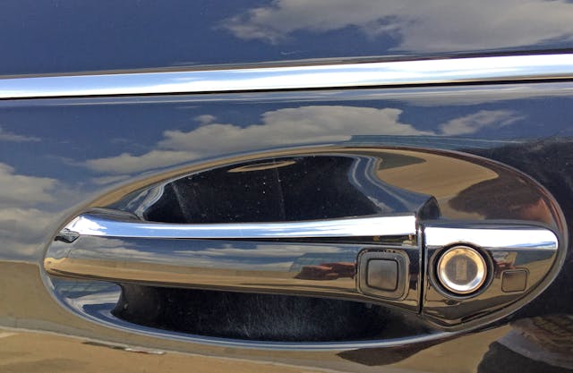
Given the parent company’s quality vacuum of the era, the condition of these parts-bin door-pulls comes as no surprise. Contrary to the Maybach’s singular flow from front-to-back, the grab handle uses reflections to perform a yin-yang dynamic within the oval door relief.

Despite its anachronous shape, you can’t see the asymmetric door pull from afar. Maybach ensured that long, parallel lines remained uninterrupted while the roof flowed from crescendo to decrescendo with minimal interference from the mirror, glass, and support pillars.
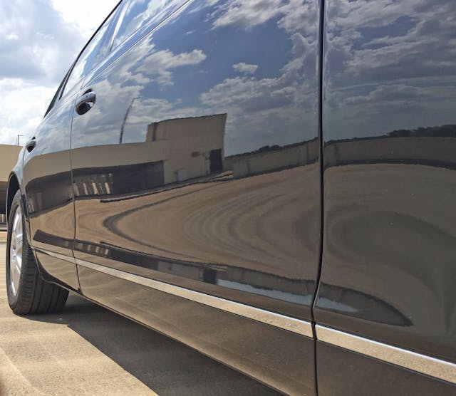
The height, flatness, and blingy detailing over the W220 is evident from the rocker panels. It’s a shame Maybach didn’t get more formal, regal door handles to go with the body modifications.
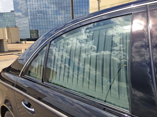
The theatrical ups and downs are contrasted by the vertical pleats of the privacy curtains.
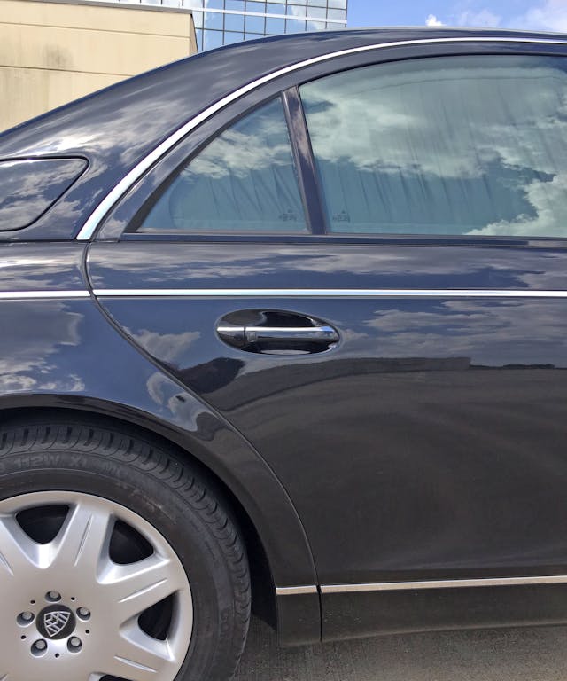
Not only does the C-pillar flow perfectly with the rear door glass forms, but one of the lines also naturally translates into the door cutout and dances in time with the front half of the wheel arch.

Compared to the relatively sporty W220, the Maybach’s taller roof and thicker C-pillar (at the base) accentuates the decklid’s downward slope. The trunk also rests atop the rear quarter panels, much like the hood up front. Both hood and trunk flow to/from their adjacent roof pillars. This leaves the fenders/quarter panels to dance to a different yet complementary beat, which is a fantastic thing to behold … and it’s why the new Maybach is so utterly depressing in the flesh.
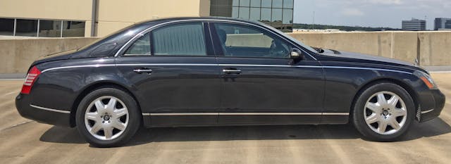
The look turns the Maybach into a two-tiered body, and only needs a cab-backward windscreen to pay proper homage to bespoke luxury creations of the 1930s. The 57 is still impressive, but it’s far cry from the stonking curbside appeal of a Rolls-Royce Phantom. That said, this Maybach is arguably a better-performing car because of this sleeker design.
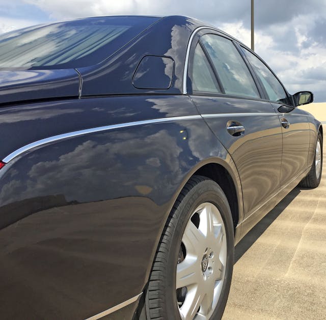
The two-tiered body is more apparent from this angle. On the lower tier, chrome strips cleanly section off the Maybach’s higher-bodyside topography. It’s just begging for one of many two-tone color treatments—I’d go with a mulberry center à la 1982 Continental Givenchy.
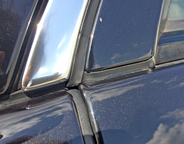
Note how every meeting point is mounted flush or even slightly sunken.

Maybach’s vertical curtain pleats and high-mount gas filler door accentuate the roofline’s speedy yet traditionally crafted design.

Maybach designers certainly took advantage of the two-tier body system from the rear. Lighting features encompass the “lower” quarter panel/bumper area while the “upper” decklid and roof pillars remain above all that red-light nonsense.
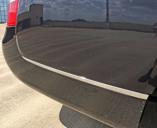
It’s unfortunate that Maybach didn’t continue the chrome strip to fully encompass the body’s higher topography area. Along with highlighting the higher body plateau, it would contrast nicely against the red taillight.
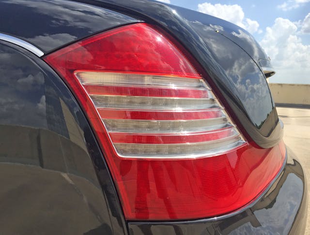
The ribbed reverse light is a Mercedes-Benz design hallmark, even if these ribs can’t manage dirt accumulation like yesteryear’s implementations.
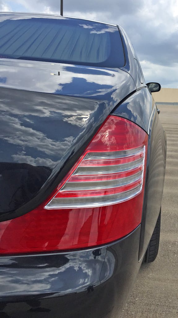
Though the roofline and body are significantly taller and more upright compared to a W220, there are still modern amounts of tumblehome adding visual speed to the Maybach’s traditional packaging.
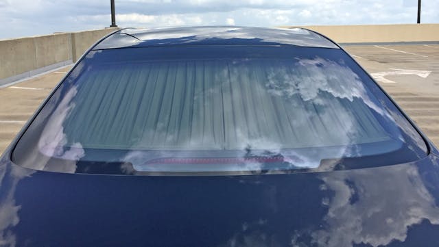
The CHMSL complements the rear window’s blackout frame nicely. Nice to see it tucked away on the bottom, so the curtain can truly shine (as it were) atop.
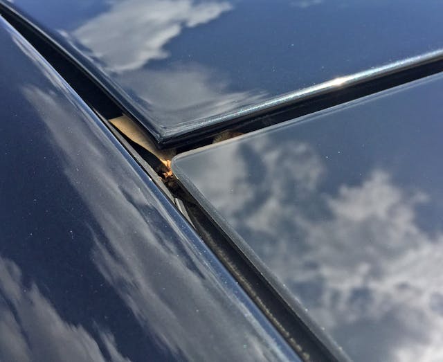
Remember that comment about features mounted either flush or sunken? Perhaps not a good thing in the case of the hidden rain gutter under the rear window and the roof panel, since leaves can still get stuck in there.

The deck lid ever-so-gently dovetails, keeping the panel from drooping at the end. Perhaps there’s also an aerodynamic benefit?
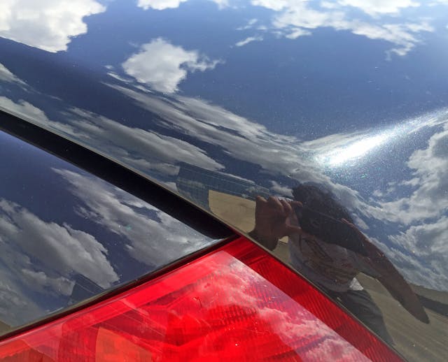
You’re forgiven if this angle looks like an E63 BMW to you—perhaps this is where Chris Bangle and crew found inspiration for their “Bangle Butt” infused flagship coupe? No, the large panel gap ensures this is pure Maybach.
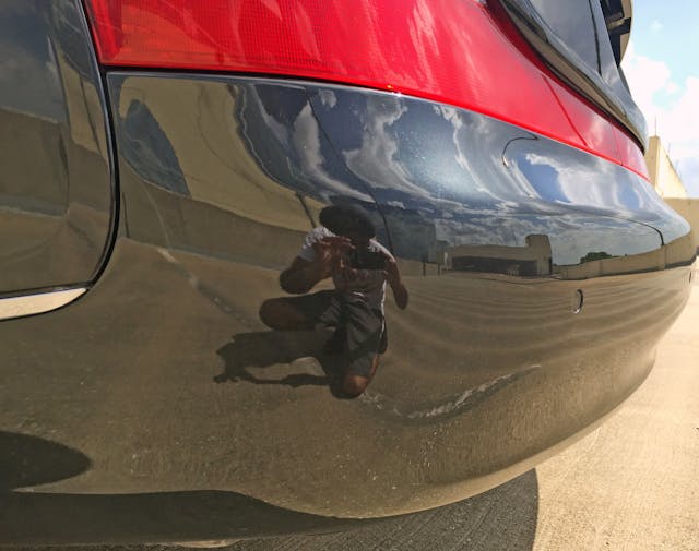
Sorry about my reflection, but note the gentle transition from functional bumper to taillight panel. The bumper literally oozes out of the rear end!

Sadly the heckblende lights are a three-piece affair—a better proposition for anyone buying a Maybach right now, but a step down in craftsmanship considering the original asking price.
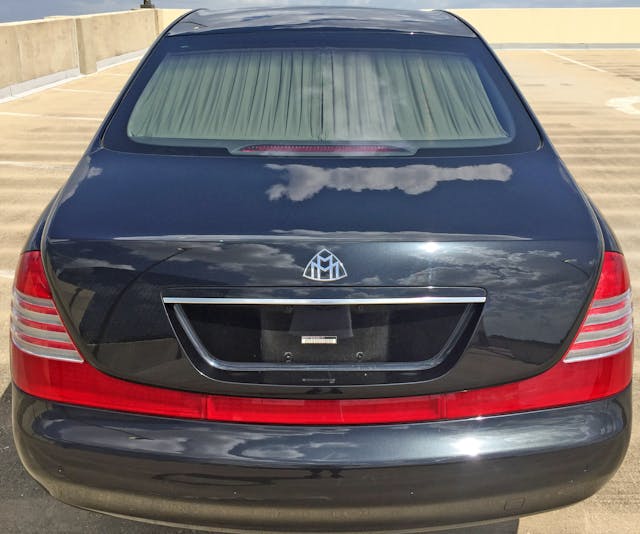
It’s hard to know whether the Maybach logo is the only ornament adoring the rear end because the previous owner removed the other emblems or because he opted for a factory delete option. All 57s should all come this way (some have Maybach spelled on the lefthand corner), since emblems are somewhat insulting at this price point.
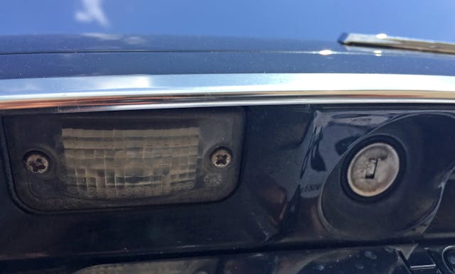
While not the first (or last) sedan with a hidden keyhole, it’s nice to see this implementation.

If the prewar craftsman were alive to behold the late ’90s, perhaps they’d appreciate how the Maybach incorporated red panels (functional or not) on a crash-worthy bumper to make the deck lid float over the body.
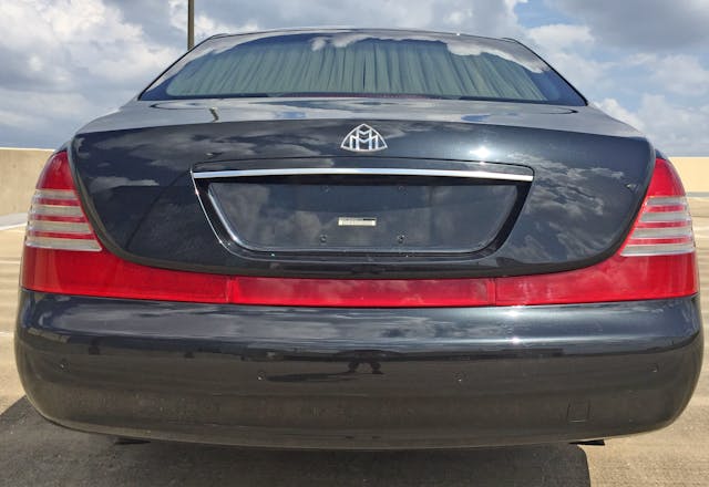
Perhaps a vehicle this luxurious shouldn’t look this sleek, especially in the era of the SUV. Poor sales figures (relative to the Phantom), bizarre ovoid details, and unexpected hip-hop credentials aside, the 2002–2012 Maybach demands onlookers to pause and absorb the unique craftsmanship, the decadent proportioning, and intuitive front-to-back flow. These Maybachs, especially in series 62 configuration, are still the biggest bosses that you’ve seen thus far.
Run how you want, boss.
Chill how you want, boss.
Floss how you want, boss.
Thanks for reading, and I hope you have a lovely day.
Thanks to Post Oak Motorcars for providing this vehicle for evaluation.

