Vellum Venom: 2020 Porsche Taycan Turbo S
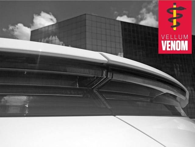
Tesla undoubtedly made electrified vehicles a performance/luxury status symbol and a statement of environmental consciousness. This new take on snob appeal in the face of a progressive, electrified future mirrors the forgotten history of the Ford Model K. That massive, six-cylinder touring car sold well enough to keep FoMoCo afloat (i.e. contributing the lion’s share of profits) while Henry’s boffins were knee-deep in mass-market Model T machinations. So let’s embrace next Model K generation of electrified luxury superiority: the Porsche Taycan Turbo S, with an as-tested price of $205,000.
The Taycan has miles of presence, thanks to decades of design DNA stemming from the stillborn Porsche 989 prototype. Let’s examine the new Emperor’s clothes with a run over the vellum.
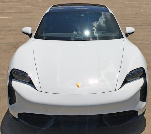
The Taycan’s 911-inspired fenders and angular hood cutlines are pure Porsche; the latter was first replicated on the Porsche 928’s bonnet. Things become far less traditional at the bumper, especially when equipped with the Sport Design unit.
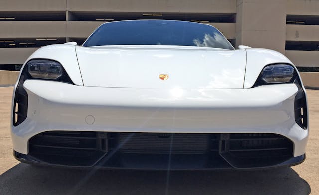
The optional Sport Design bumper gives a “puffy cheeked” look, both in the painted area’s more aggressive curvature and via enlarged air curtain vents.

Let’s discuss air curtains. Note the blue air line going into the bumper and then shooting over the front wheel. Odds are, an air curtain reduces turbulence from those massive 21-inch wheels, with a marginal improvement in aerodynamics. Which improves electric battery range, in theory at least.
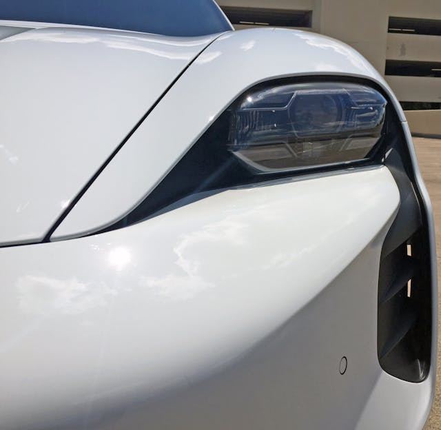
The interplay of headlight and air curtain seems silly at first, but they share the same empty, oddly-formed space in the Sport Design bumper. The standard bumper has less presence, but the question remains: Does this bumper have air superiority?
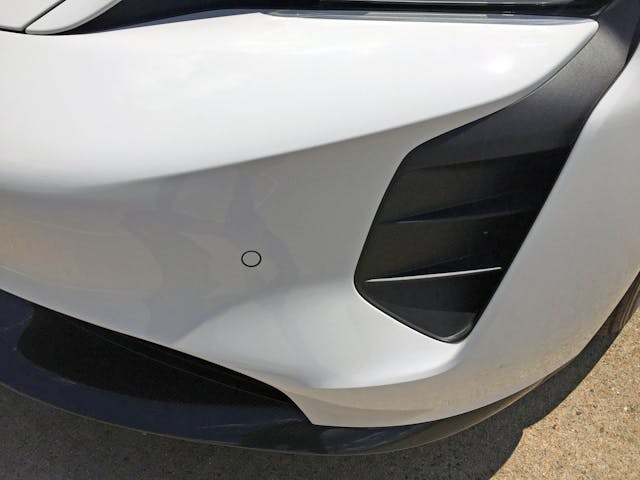
Hopefully the air curtain’s black plastic doesn’t turn chalky after years of sunbathing/burning from an orbital buffer. But the perfectly flat parking sensor (i.e. not mounted on a pimple) will endure as a testament to designing a bumper that’s both beautiful and functional.
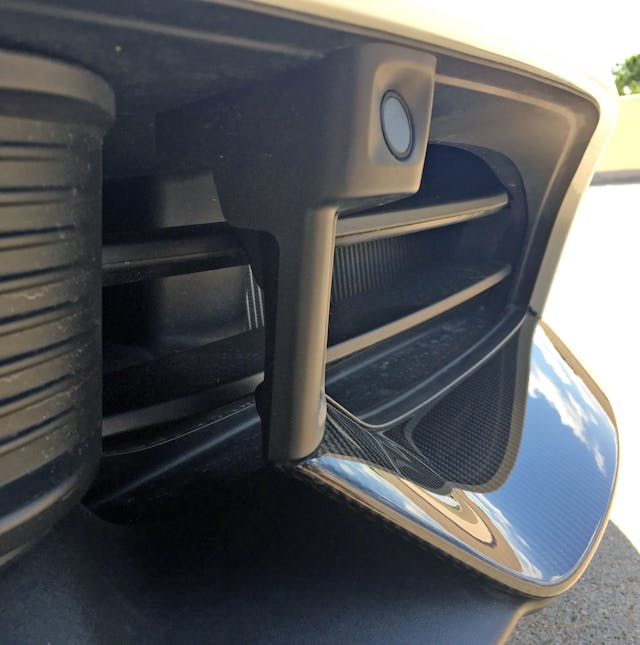
The forward parking sensors live within a sunken panel that juts out rather rudely from the splitter’s gentle carbon fiber curve.

The bumper’s central panel looks decidedly downmarket. At least this Taycan doesn’t have the off-center “seeing eye” cruise control eyeball.

The cover of black plastic shadows masks the bumper’s confusion. This is a very fussy design considering how small grilles need to be for an electric car to keep its cool.

Considering all the mess south of the painted bumper, one more bit wouldn’t hurt: it’s a shame Porsche couldn’t integrate the tow hook (currently behind that white circle) down there too.
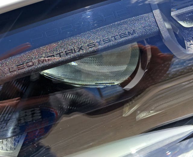
The LED MATRIX SYSTEM feels like marketing jargon, but it’s par for the course. (See BMW’s Adaptive LED branding on its lamps.)
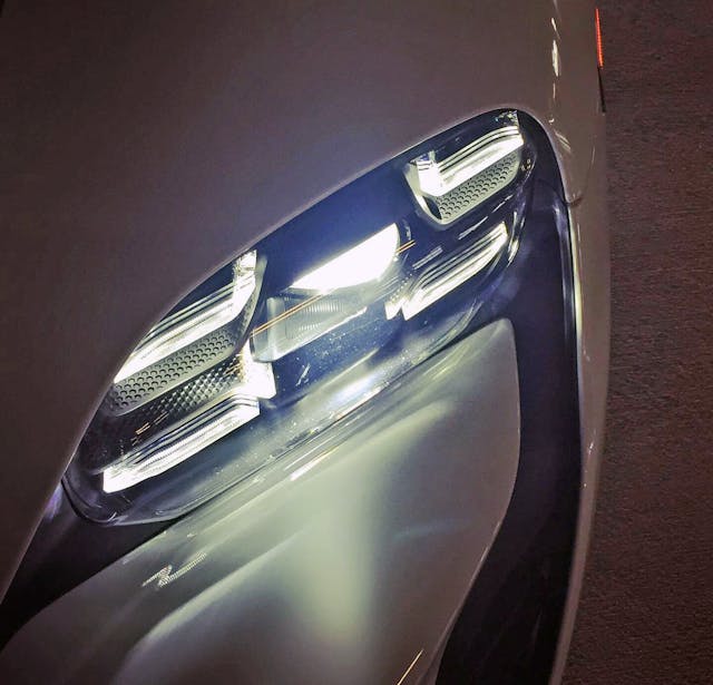
The five lights do make an eye-catching matrix (and they are awesome at night, no question!), but the corny honeycomb casting wasn’t necessary.
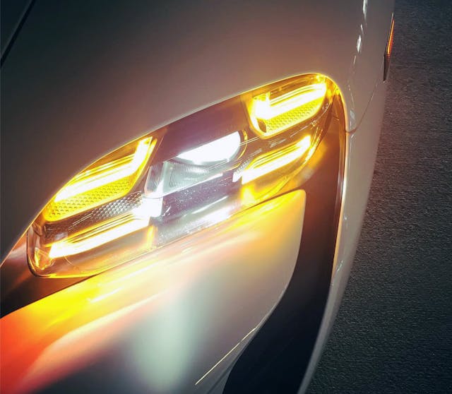
Activate a signal light and the real magic happens: the formerly white lights change to a proper amber!
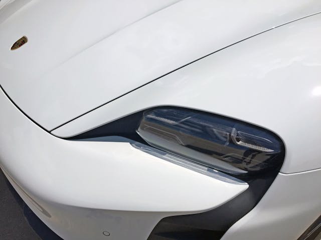
The tucked-in Matrix LED lights are far from the classic round headlight of an air-cooled 911, but it’s a fine reinvention for the age of the electrified flagship performance sedan.

The aforementioned hood cutlines are very 911, and the negative area carveout in the hood’s center section is a fantastic bit of Porsche DNA.
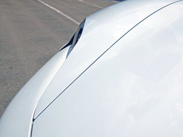
Squint hard enough and you can see the family resemblance to 911s of yore.

Kind of a shame the fenders don’t rise up even further to the occasion.
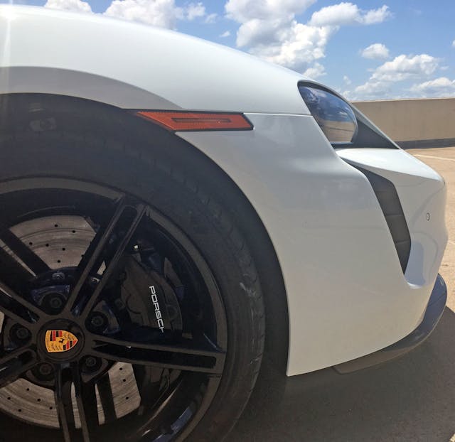
The integrated headlight/air curtain bucket actually has a McLaren feel. Perhaps less so on Taycans without the Sport Design bumper?
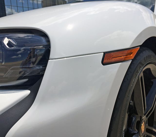
Turn signal repeaters that bend to a flat-faced wheel arch are par for the course these days, but that slotted relief in the center is a novelty.
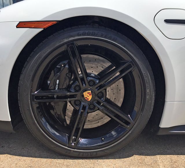
It’s a shame the flat wheel arch takes away from the subtle fender curves and the sympathetic contouring of the charging door.
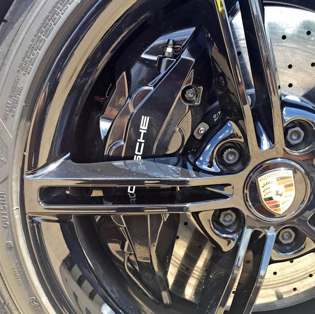
The Taycan Turbo S wheels replicate the Mission E concept, designed to prioritize brake cooling over aerodynamics.
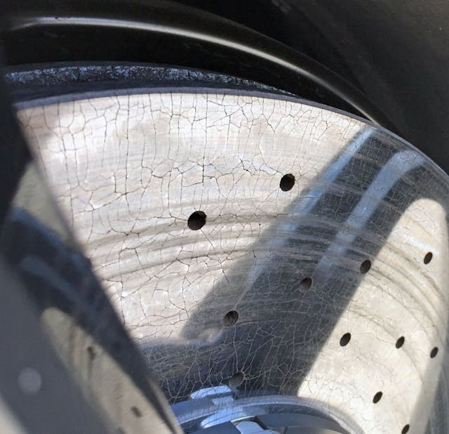
Regenerative brake much? No matter; these suckers are gonna get worked hard when attached to a 5100-pound monstrosity with 750 horsepower.
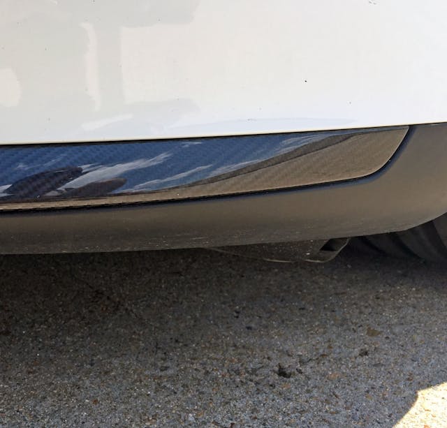
Granted, an electric sedan will likely see more parking lot curb rash than a track-built sports car, but at least let the carbon bits extend all the way to the end of the panel!
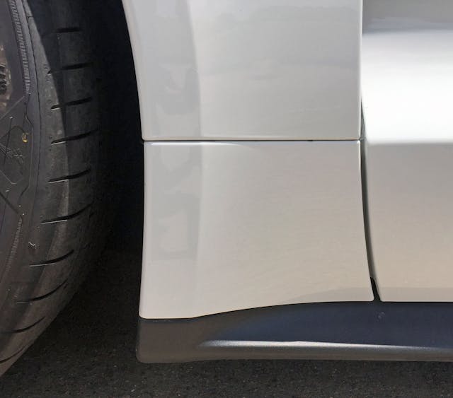
Too bad the fender can’t extend all the way down to the (again, NOT carbon fiber) rocker cover. The very square intermediate panel visually slows down the package.

Imagine if the fender wasn’t kneecapped, instead flowing fully downward while the door’s negative area takes the fender’s clean lines to the next level with an effortless cooling vent.

While it isn’t a cheesy chrome panel (like so many cars these days), this still looks tacky and superfluous. But run your finger under it and the charging door to the left (or right, depending on which door you choose) automatically opens.
Even better, it’s not a single piece of plastic; note the central gap that separates the polished upper from the textured lower half.
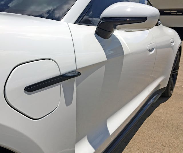
Good designs always have interplay between harsh angles and soft curves, and perhaps the rigid cooling vent to curvaceous bodyside fits that particular bill.

The modest black panel over the cowl offers no surprises, as it should in a bespoke platform.

The windshield’s trapezoidal wedge makes me long for the Citroën Karin, but this bit of angularity is purely functional (front camera?) and not intended to integrate into the Taycan’s curvaceous body.
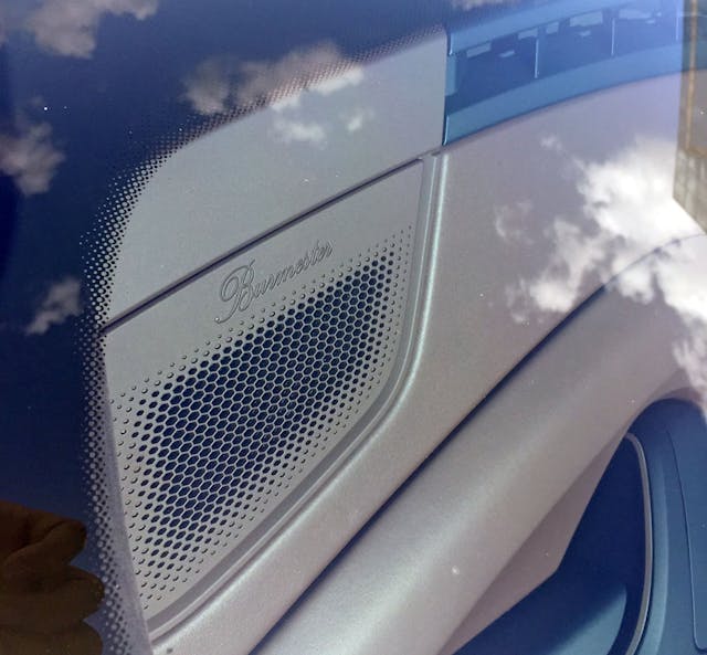
Burmester Audio is a pricey add-on, and these speaker grilles advertise the privilege of ownership. The progressive honeycomb grille emulates the headlight’s internal texture.

A fixed glass roof always looks better than a retractable affair, as there are no unsightly cutlines for the mechanical bits. And the glass, rain gutter, and (painted) roof pillars are contoured to look strikingly like a 911.
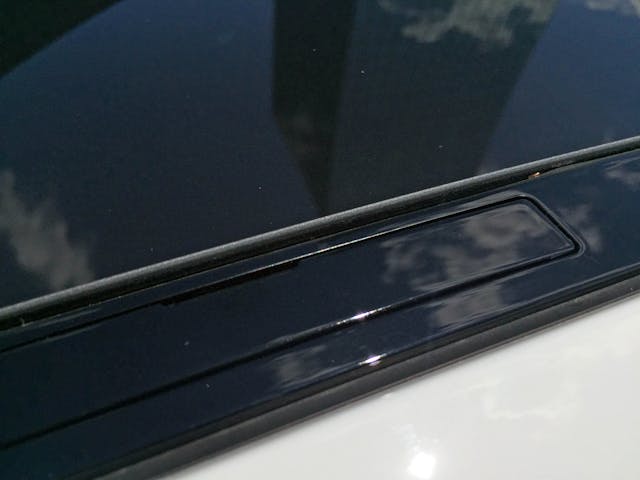
Gotta love the little doors for hiding roof/bike rack mounts, something that’s seemingly mandatory for German vehicles.

This A-pillar is surprisingly thin by today’s standards, while the black plastic triangle at the end (beginning?) of the glass is unfortunate: The Taycan needs to be more like the posh Aston Martin DB11 and have mirror sprout from that triangle.

The mirror arm’s strong forward thrust is a nice contrast to the housing’s swept back lines.
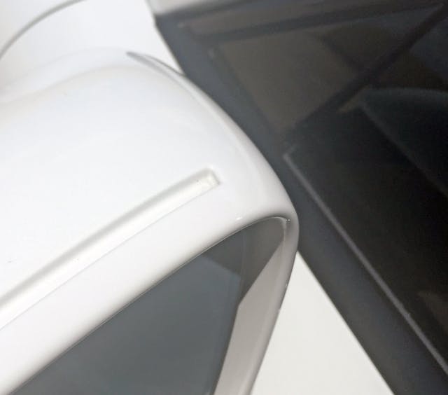
The square, trough-like feature atop the housing feels out of place.

Especially out of place since most of the body side is curvaceous, with a greenhouse and fender flares heavily infused with 911 DNA.
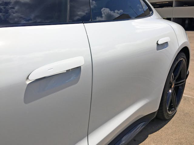
Oh look, the door handles do a cheesy party trick like the Tesla model S. Except not, as the Tesla’s flush-mount affairs magically poked out of the body. I suspect these will be far more reliable in the future … if that matters to the Rich Rebuilds of the world.

Focus on the greenhouse and this is truly a plus-sized 911, thanks to tinted windows masking the massive B-pillar. This low slung “four-door coupe” bodystyle popularized by the 2004 Mercedes CLS looks far more true to the brand than the tall, chubby Panamera five-door hatchback.
This is the Porsche 989 incarnate: In the age of Lamborghini/Bentley/Porsche/Rolls Royce SUVs, that’s kinda awesome.
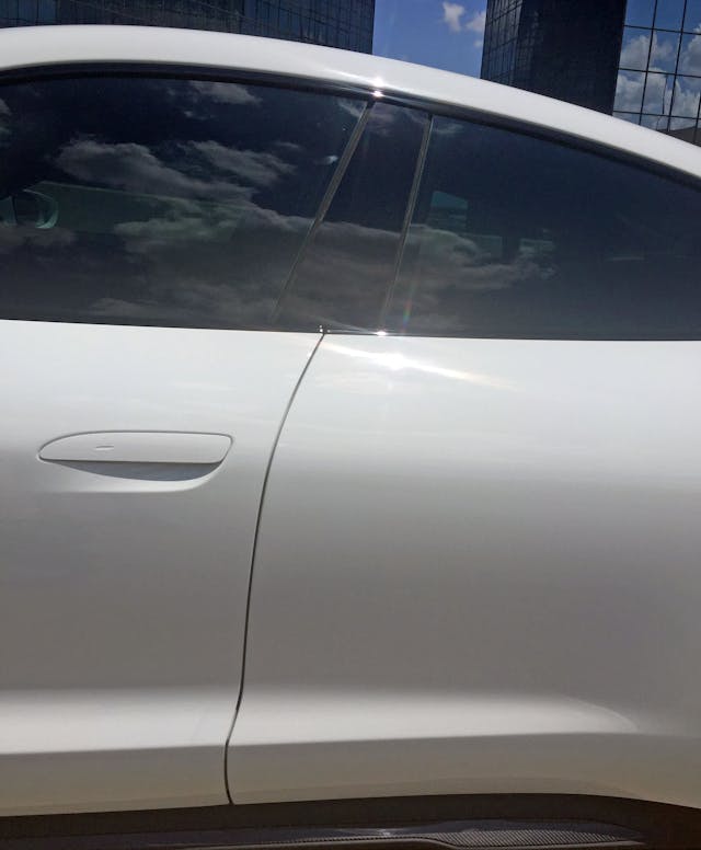
This could be a 911 coupe seen in a funhouse mirror. The lines are right, but the proportions are significantly larger.
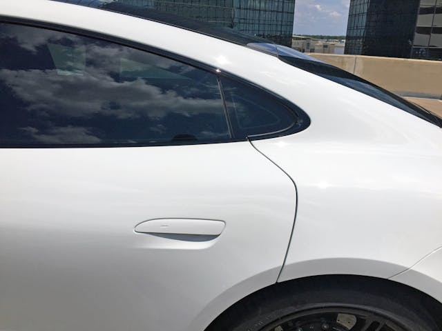
The fast C-pillar and muscular rear haunches are far more 911 than Panamera. Nice.
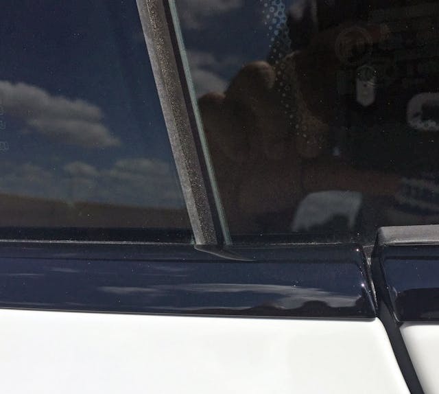
Too bad the rear door’s cutline doesn’t line up with the line between the rear window and quarter window. This is one of the rare times the Taycan kills the 911’s signature bodyside flow.
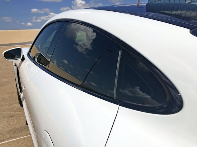
And there’s something wonderful about a long wheelbase 911: Low(ish) to the earth and so deliciously curvaceous.
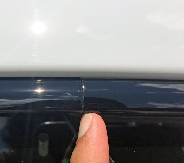
The shadowline trim around the greenhouse looks great in person, even this seam is pretty subtle. A one-piece trim from A-to-C-pillar is preferred, but tolerable for a vehicle that starts at “only” $103,000.

The C-pillar matches the A-pillar as rear glass extends in a very 911-like manner. Whether or not that’s a good thing is up for debate: Rear pillars are expected to have less distractions to their flow, to move visually faster than front pillars.

The almost fingernail-thin, rubber-infused meeting of glass roof, glass backlight, and gloss black rain channel is impressive to behold.
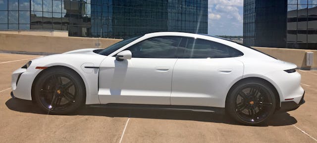
The tall 21-inch wheels provide some perspective to the following statement: The Taycan is very long and low to the ground, in the 911 tradition. And not unlike the 911, rear seats and cargo space are far from paramount, because that roofline is anything but practical.
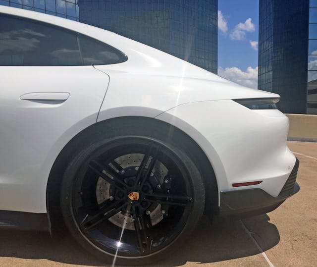
The rear’s flattened wheel arch kills the Taycan’s flowing fender. The rear door’s heavy encroachment into the wheel is uncommon in this day of big doors accommodating rear-seat passengers, but it’s a great example of function following form. Don’t worry, you can still get in there.
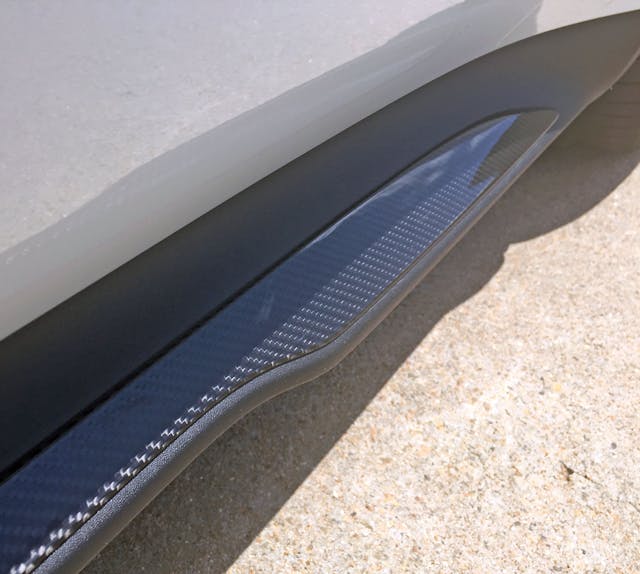
Much like the front, the rocker panel is only partially carbon fiber. It looks cheap, but the Turbo S is anything but.
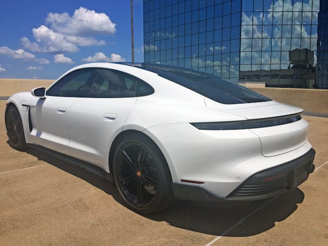
Unlike the 911, the Taycan’s ovoid greenhouse bends sharply upward. A sign of the times, but this is a marked departure from the 989 prototype, which did look “visually” slow (by today’s standards), because the greenhouse had a less-aggressive upward trajectory.

The short deck is another element of Porsche DNA, and the Taycan’s downward sloping trunk (not a hatchback like the Panamera) has an aperture worthy of a mail slot.

The cabin’s slight tumblehome and the fender’s significant flare gives the Taycan a classic, wide-body 911 feel. Only a gentle bend in the quarter panel (start at my finder, follow the shadow) reminds the viewer that the Taycan has aerodynamic superiority in mind.
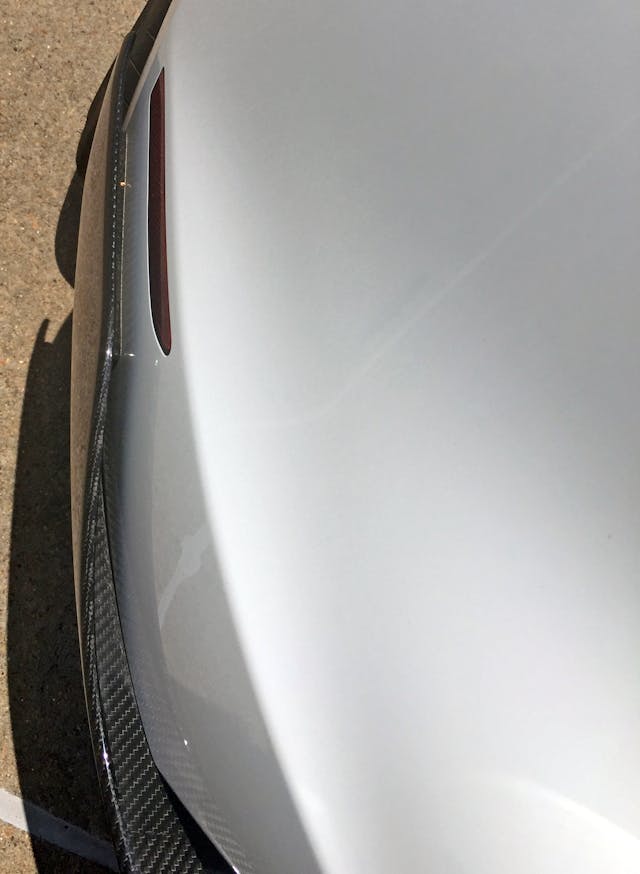
There’s another, harder crease in the bumper, above the Sport Design’s carbon fiber winglet. And it’s all carbon fiber this time … thank goodness for that!

The thin taillight treatment is very “on brand,” but there’s something else marking the transition from side to rear: a thin bend at the side transitions into a wider blade that sweeps downward/inward.

Unlike the uninterrupted sheet of roof glass, things get dicey when integrating a trunk, spoiler and rear window onto the Taycan’s posterior. The larger section of white paneling (above the taillight) is for the pop-up spoiler, and the shorter section includes a fake panel to “visually extend” the rear glass. More on the DLO FAIL later.
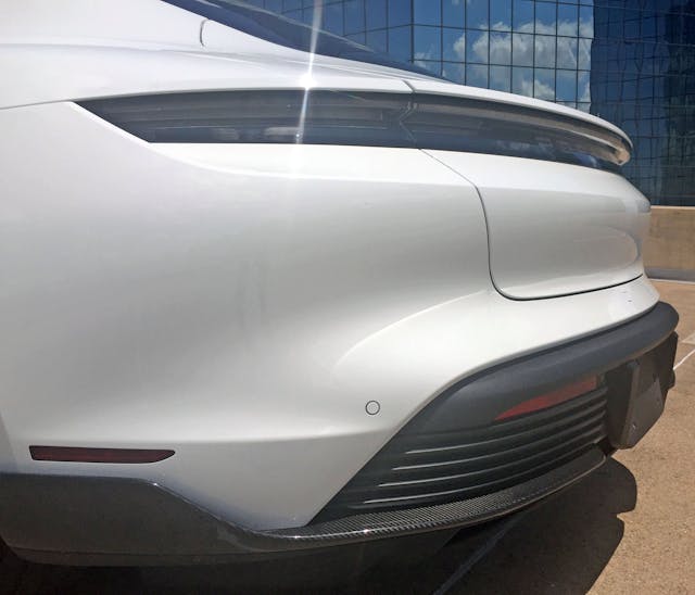
There are many strong horizontal lines presented, but once again, the decklid’s rounded corners (forming another horizontal line) fight the flow. Implementing the same angular transitions seen in the hood (or from a 993’s rear hood, if you prefer) is more muscular and is yet another place for Porsche DNA to truly shine.

The smoked taillights have strong bevels with a fine linear texture underneath. It’s all very futuristic in a retro-Tron kinda way.
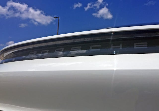
The decklid has a strong bend below the taillights, necessary since it is tall (i.e. there’s a lot of real estate) with a disproportionately tiny footprint for the lights.
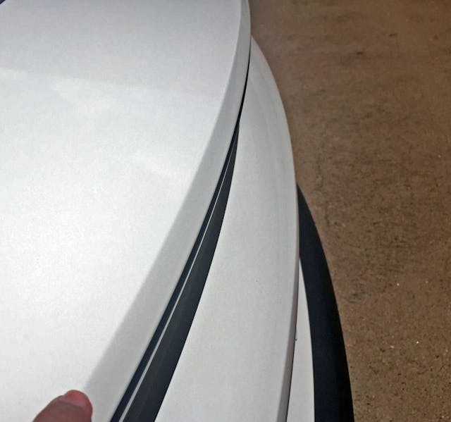
The hard crease above the lights forms a dovetail that likely improves downforce, even with the spoiler retracted.

It’s clear why Porsche needed wanted the back glass to extend deeper into the trunk: If the glass ended where the trunk begins, the rear end would look taller and far less sleek. Too bad the three-piece decklid ensures this is just a visual cheat. It’s DLO FAIL as per examples in the past Vellum Venoms, except now the daylight opening pertains to the rear window. And to beat another dead horse, imagine if the trunk lid’s lower cutline followed the natural bend seen in the shadow?
Natural light should, when possible, compliment your complicated design and not add extra/unwanted lines.

The trunk release button is mounted smack dab in the center. And it’s a little dowdy: a tiny metal Porsche crest as a button instead would look more luxurious, befitting of the asking price.
Sure, 911s may not have a rear crest, but the Taycan is, after all, a luxury sedan. Go ahead and flaunt it with a fancy trunk pop button.
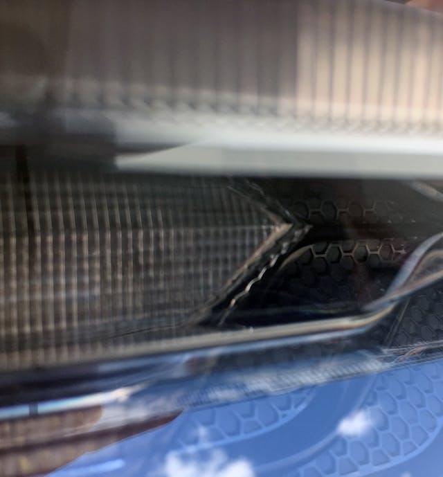
Also, just like the front, the taillights replicate the headlight’s honeycomb texture.
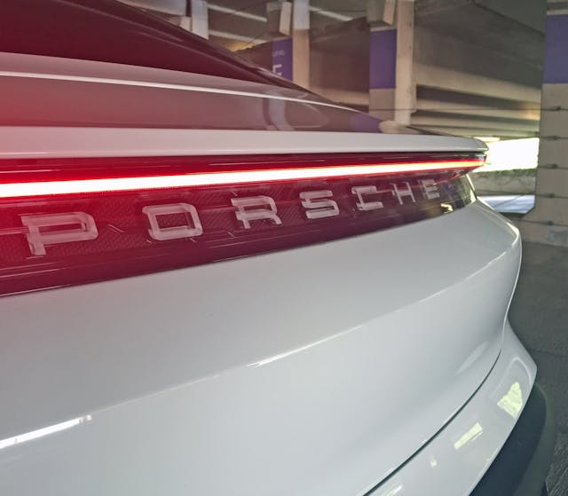
The decklid has a significant cutout of negative area to both reduce bulk and to let the taillight’s radical heckblende (i.e. it goes from corner to corner, uninterrupted) design truly shine.
The translucent P-O-R-S-C-H-E letters are unlit, but that might change in 2021 if the Internet isn’t lying.

There are a plethora of lines out back, much like the front. They remain parallel as they bend around the bumper, ensuring the look is cohesive and somewhat upscale. Even the reflector light is forced to remain on the level because of it!

The bumper appendage holding the license plate has chiseled bumperettes at both corners, much like many a Malaise-era family sedan.
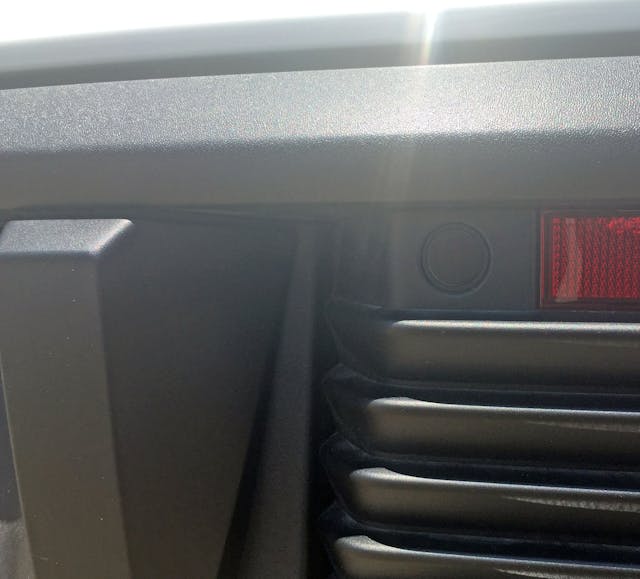
License plate bumper inserts are designed with interchangeability between USA- and European-sized plates in mind, but this one feels like a tacked-on afterthought.
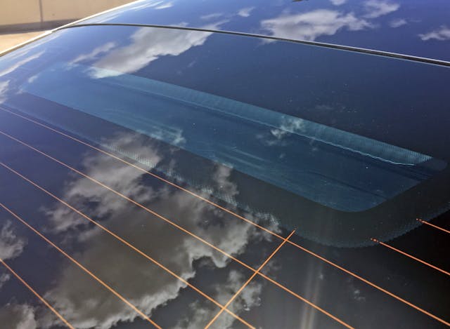
Not so with the mandatory CHMSL: A finer integration under all that glass couldn’t be possible!
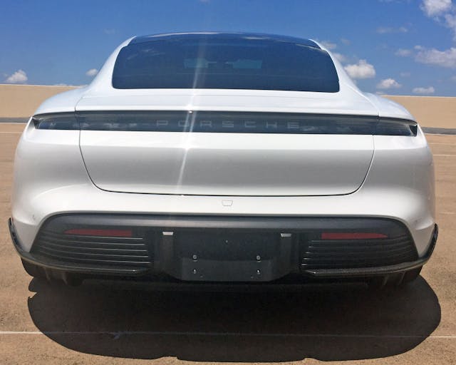
The Taycan is subtle, finely crafted, and looks beyond futuristic from many angles: It truly blows the doors off the now-outdated Tesla Model S. Too bad about the rear window’s fake extension … but I digress.
Electric cars require a cleaner and more minimal design aesthetic, perhaps because they are far less complex than a gas car under the skin. There’s no need for a flashy grille, bold tailpipes, or even a fuel-filler door mandated to one corner of the posterior.
If the design language holds true, a truly affordable, mass market* electric car need not diverge significantly from the language presented here. Now to patiently wait for that reincarnation of the Model T. Thanks for reading; I hope you have a lovely day.
*My apologies to Nissan Leaf owners, as it’s tragic how your somewhat-affordable machines get far less credit than they deserve, at least in America!

