Automotive ad legends Fitzpatrick and Kaufman “were not mere mortals”

It’s been said you should never meet your heroes because they’ll never live up to your expectations. Rob Keil didn’t find that to be true. Instead, he learned that sometimes your heroes turn out to be bigger, better, and more fascinating than you ever imagined. Book-worthy, even.
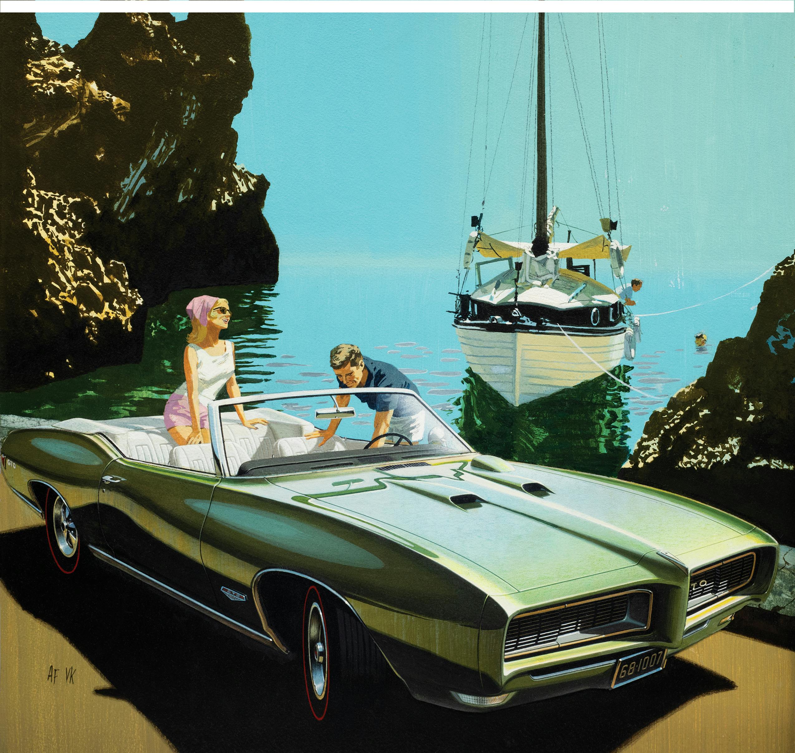
“Fitz and Van are legends, the best of the best,” says Keil, author of the newly released, 200-page retrospective Art Fitzpatrick & Van Kaufman: Masters of the Art of Automobile Advertising, published by Advection Media. “You don’t have to love cars to love their work. A lot of people know their ads without knowing who they were.”
Keil used to be one of those people. He was only 10 the first time he saw one of the duo’s Pontiac illustrations while flipping through the pages of his dad’s old National Geographic magazines. Keil immediately fell in love with not only the cars but also the detailed backgrounds, which were set in exotic locations around the world.
“I wondered, who is AF/VK?” Keil says, referring to the initials at the bottom of each illustration. “At the time you couldn’t just jump online and find out. Clearly these guys were the best—their initials popped up on every one of my favorite ads. I just had no way to find out who they were.”
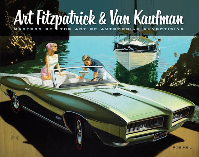
Fast forward to Keil’s first class on his first day of college: “Advertising Layout and Book Design.” The instructor spoke about the role of an advertising director, and Keil knew immediately that’s what he wanted to do. He still didn’t know who AF/VK were, but he certainly knew where his inspiration came from.
“The fact that I’m an art director in the advertising business is not a coincidence,” says the 52-year-old Keil, who lives and works in the San Francisco Bay area. “I realized there was a job that allowed you to work with people like that, and that was really exciting for me. I’m doing what I was meant to do, and I thank Fitz and Van for helping me find my way there. They’ve inspired generations of advertising designers and car designers. They made it an irresistible thing.”
Eventually Keil was able to learn the artists’ identities through Google. While Kaufman had passed away by then (he died in 1995), Keil located Fitzpatrick and sent him a letter describing how his work had inspired him and helped shape his career. “Fitz,” as his friends called him, wrote back, and the two kept in touch. Then Keil approached Fitzpatrick with the idea of making a biographical video about him. The first interviews were recorded in April 2010, when Fitz was almost 90.
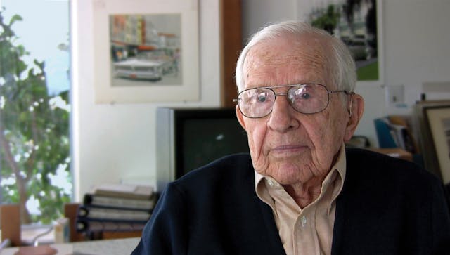
The video was never produced, since the two could not agree on the format, but their time together was hardly wasted. “I knew how I wanted to do the video, but I also wanted to do it the way he wanted—he was my hero,” Keil says. “That didn’t work out, but it evolved into this book, which is the best way to present it anyway. I’d been cutting Fitz and Van ads out of magazines and saving them for years, and I’d created my own little album. The challenge became, how do I cull this down into a book?”
Beyond showing the duo’s masterful artwork, Keil wanted to answer the questions that he had asked himself for years: Who were these men, and how did they create the ads that became legendary? “We know the work, for sure—few of us know the people or their tricks of the trade.”
Fitzpatrick, who died in November 2015, just shy of his 96th birthday, painted and designed cars for more than seven decades. The son of an artist and grandson of an architect/artist, Fitz said he was born with “designer genes” and was immediately attracted to cars. He once told Hagerty, “I grew up in Detroit. What does a guy draw besides cars?”
At 17, Fitz lied about his age to get into The Society of Arts and Crafts and the Detroit School of Art, and a year later he was hired by John Tjaarda at the Briggs Body Company. Fitzpatrick moved to California at 19 to work with Howard “Dutch” Darrin, designing custom-built Packards. After serving in the Navy during World War II, he signed on to do Mercury ads in 1945.

Kaufman attended what is now known as the California Institute of Arts and, much to his father’s chagrin, he planned for a career in the arts. He was hired as an animator at Walt Disney Studios, working on Fantasia (1940) and Dumbo (1941), and during World War II, he directed several training films. Kaufman thought his future might be in the movie business until he visited New York City, fell in love with the atmosphere and the people, and found plenty of work in advertising.
Fitzpatrick and Kaufman shared an agent, and in 1950, when Mercury asked Fitz if he knew an artist he’d like to collaborate with, he suggested Van. With Fitzpatrick drawing the cars and Kaufman the backgrounds, it was the beginning of a history-making partnership. The two later collaborated on Buick ads from 1954–58 before moving on to Pontiac, where together they created 285 memorable illustrations from 1959–71. They also produced Opel ads from 1972–73.
Keil admits that prior to his friendship with Fitz, he had no idea the duo had worked for other automakers before and after Pontiac.
“The Mercury stuff was good, but they had mostly white backgrounds,” Keil says. “The Buick stuff was inspired—it elevated Buick to the height of 1950s glamour. The places they put the cars seemed very cosmopolitan. They created an image that said, ‘A glamorous lifestyle begins with Buick.’ It became a status brand, and Van’s backgrounds really had a lot to do with that.”
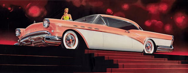
But it was Fitzpatrick and Kaufman’s work for Pontiac that turned them into superstars.
“Pontiac was at the bottom of GM’s lineup when they came onboard, and they made it a really exciting brand in the ’60s,” Keil says. “Of course, the cars were good too—Grand Prix, Firebird, GTO—but they took those cars and gave them an aura of style and sophistication.”
Keil says he stepped away from his book project for about five years to devote time and attention to his advertising job and to raise a son, but when he dove back into it, he was determined to see it through. It took three years of evenings and weekends to finish the job.
Keil says he found plenty of surprises along the way. First, while seeking out original artwork to photograph for the book, he didn’t anticipate finding a “small network of people who own those paintings and who were willing to share them. I spent a lot of time getting on planes and going to see this stuff. And a lot of it had never been published before—like the thousands of (photographic) slides that were used to create the backgrounds.”

The author was also surprised to learn about three artists—Dale Gustafson, Roger Metcalf, and Al Weston—who played prominent roles in Fitz and Van’s success, creating images to help ease the workload. Keil says in one year at Buick, the team produced 47 print ads plus a dealer brochure with dozens of illustrations. “I had no idea the degree of their involvement and how fantastic their work was,” he says of Gustafson, Metcalf, and Weston. “They were not in the public eye; they were totally behind the scenes. But their work was a huge deal.”
Learning the technical aspects behind Fitz and Van’s images was like pulling back the curtain and seeing how the secret sauce was made.

“Nothing was left to chance,” Keil says. “They carefully photographed the cars and the places they wanted the cars to be. It gave me some very interesting insight into how it was all done—it was kind of a wow moment for me.
“Fitz also explained that ultimately the color of the car doesn’t matter—or shouldn’t matter. He said, for example, don’t think of it as a black car. Think of it as a car that has black surfaces and white surfaces, depending on the lighting and the angle. Look at what it looks like in the photograph. That’s the truth. Show that in the illustration.
“Fitz found that putting a black car or a white car in the shade with colorful surroundings made the cars look the shiniest, and it really does look like a mirror. How the images reflect off the car, how they change depending on the contour … He paid attention to everything. He learned a lot of tricks over time.”

Keil explains how Fitz once illustrated a 1970 Tempest in the rain.
“He took a hose to his own car to get the droplets right and to see which direction the rain would roll off the hood,” Keil says. “Then he added every individual rain drop. He never did another one like that. It was like he said, ‘OK, I did it,’ and he was done with rain.”
Keil was also surprised to learn just how small the actual paintings were. “I thought they’d be bigger, like 2 x 3 (feet), but they’re just about the size of record album. And the reason for that is speed. Every square inch takes a certain number of hours. So, to get them done on time they had to work small.”
With that said, “The amount of detail is astounding. I’ve looked at these under a magnifying glass, and every little thing is perfectly done. It’s just incredible—right down to adding a tiny yellow reflection in the bumper of the road’s center line, when there’s no way that was in any photograph. Fitz just knew it belonged there. Few people would notice that stuff, but he insisted on doing it right.”
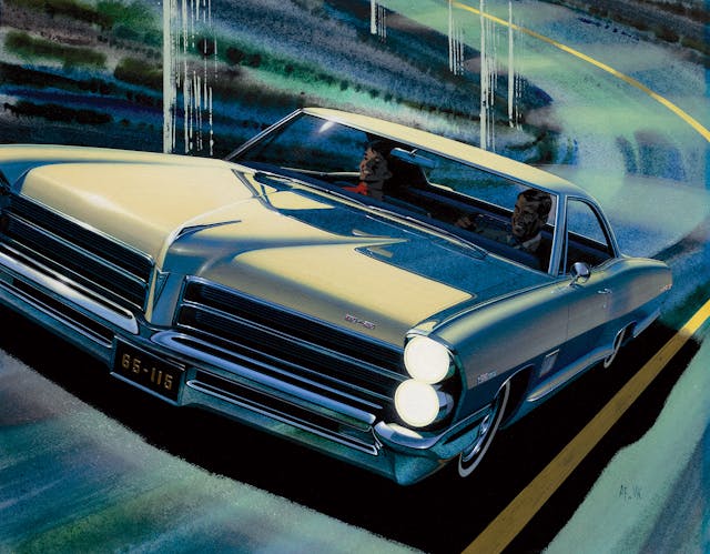
Keil used the endpapers of the book to emphasize that point, doubling the size of Fitz’s painting of a 1965 Pontiac 2+2 to illustrate the tiniest of details.
He explains that since each image was a collaboration, there was a lot of back and forth.
“With Fitz producing the car and Van the background, things had to happen in a certain order,” Keil says. “Fitz couldn’t add the reflections in the car until he knew exactly where Van wanted the people and buildings and everything else in the background. And the one of the last things that Fitz did was the windshield. It was complicated because of the layers you could see through the glass.”
Although Keil says he appreciates automobiles and loves the world of advertising, he has never worked on a car ad. “Nor do I have a particular ambition to. The car business is so different today than it was in the ’60s. That was a more glamorous era. It’s hard to find anything new to say about cars or new ways to present them in print.”

With so many automakers reaching into their past and reviving once-popular models, might the Fitz and Van magic be recreated in advertising? Keil doesn’t think so.
“Not because it isn’t technically possible, but because we’ve moved on to a different place,” he says. “People are used to seeing things in a photograph or created on a computer. Could the best artists in the world do something like this? Maybe, but it will never happen. Sadly, that era has passed. Fitz and Van were yesterday’s news by the time they were finished. People don’t believe illustrations like they do photographs, and Fitz and Van manufactured reality with paint and colored pencils.”
And they did it beautifully.
“They were not mere mortals. Their work was out of this world,” Keil says of AF/VK, whose ads inspired him long before he ever knew their names. “You’d be hard-pressed to find a bad one … There’s no such thing.”


My uncle was Roger Metcalf. He air-brush painted most of the Pontiac car illustrations (those which were of a better quality) and illustrated interior views for yearly brochures. As I understood it, Fitz traveled Europe, etc., photographing the backgrounds and Kaufman painted the backgrounds. Roger worked for Fitz under the agreement he would never reveal that he had painted them. My uncle worked from Black and white Polaroid photos and added six inches of width to the illustration as he drew it. Roger and his family lived in Stamford, Connecticut. I’ll have to buy your book.
Very nice article, yes their artwork was simply the best… the book looks like a really nice addition to any automobile library and I’ll certainly be picking up a copy for mine…